Oxfam Australia eBooks campaign
In addition to their committed supporters, Oxfam Australia wanted to reach a new audience of equally passionate people eager to act on big-picture issues such as climate, water scarcity and fast fashion.
The campaign was a chance to move away from brand-driven marketing towards an easy, commitment-free way for the audience to engage with the charity before being called and asked to convert to a regular monthly gift. The creative had to be needs-focused rather than a generic brand message, show evidence of impact and differentiate Oxfam from other charities.
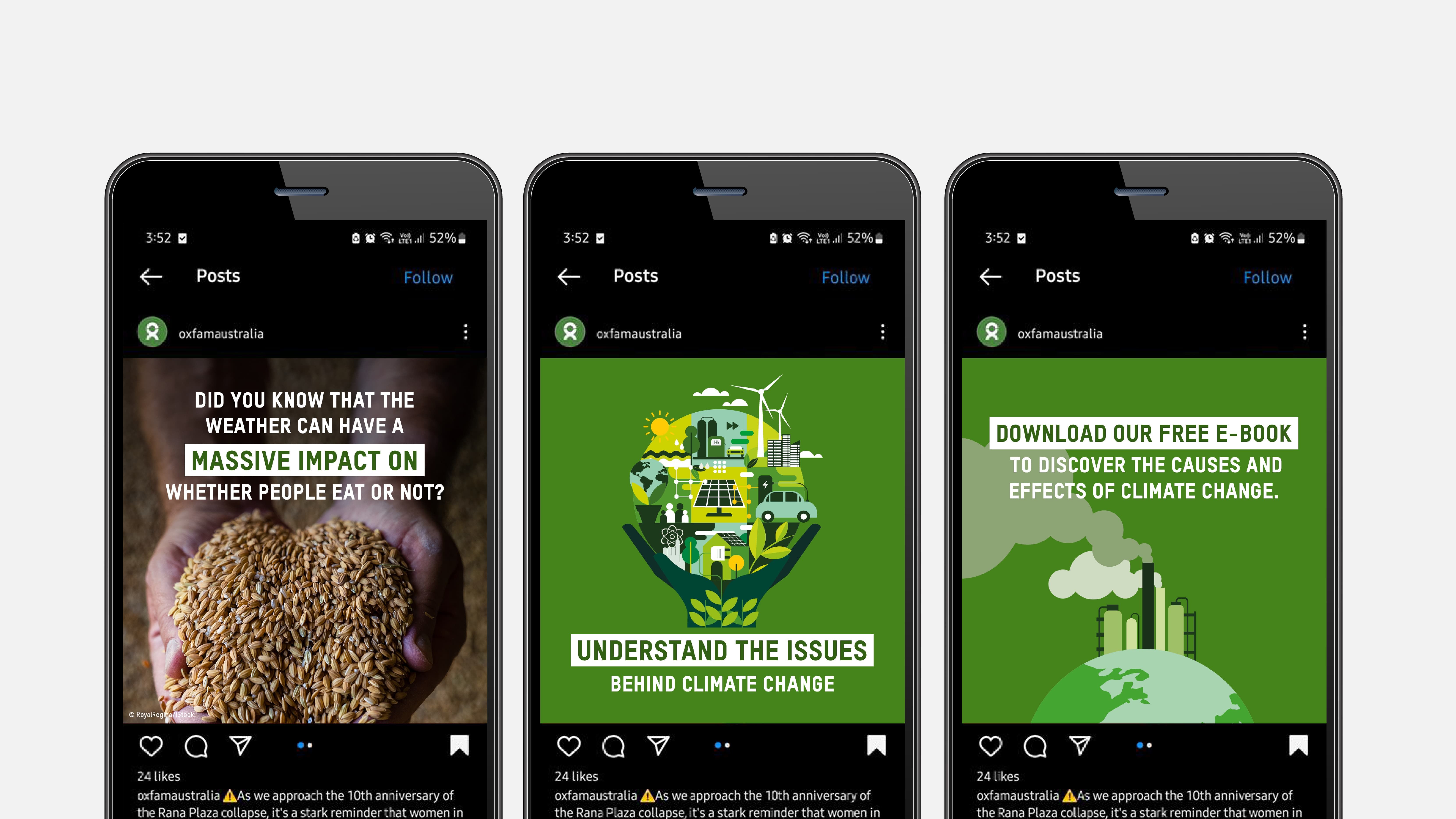
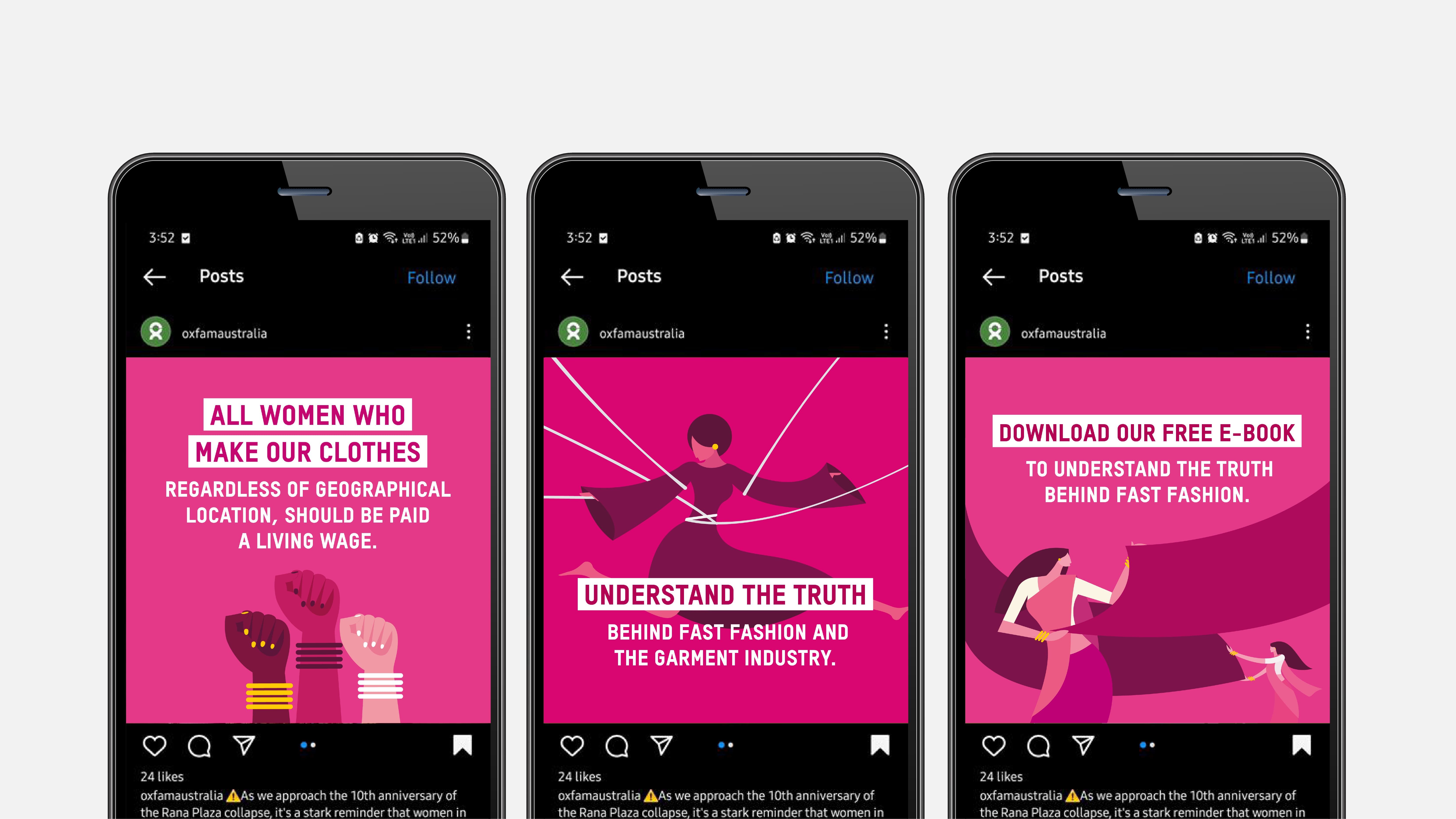
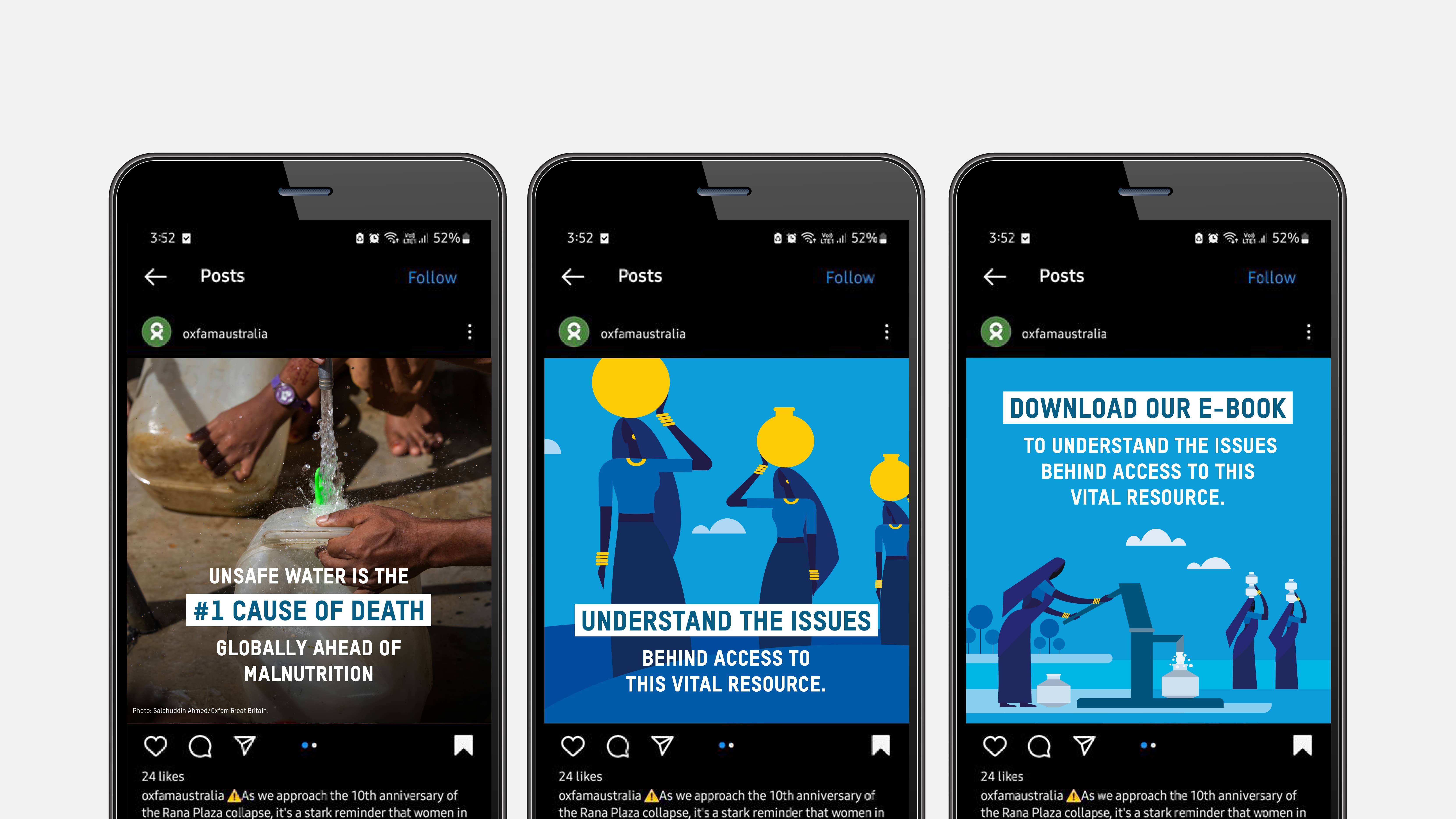
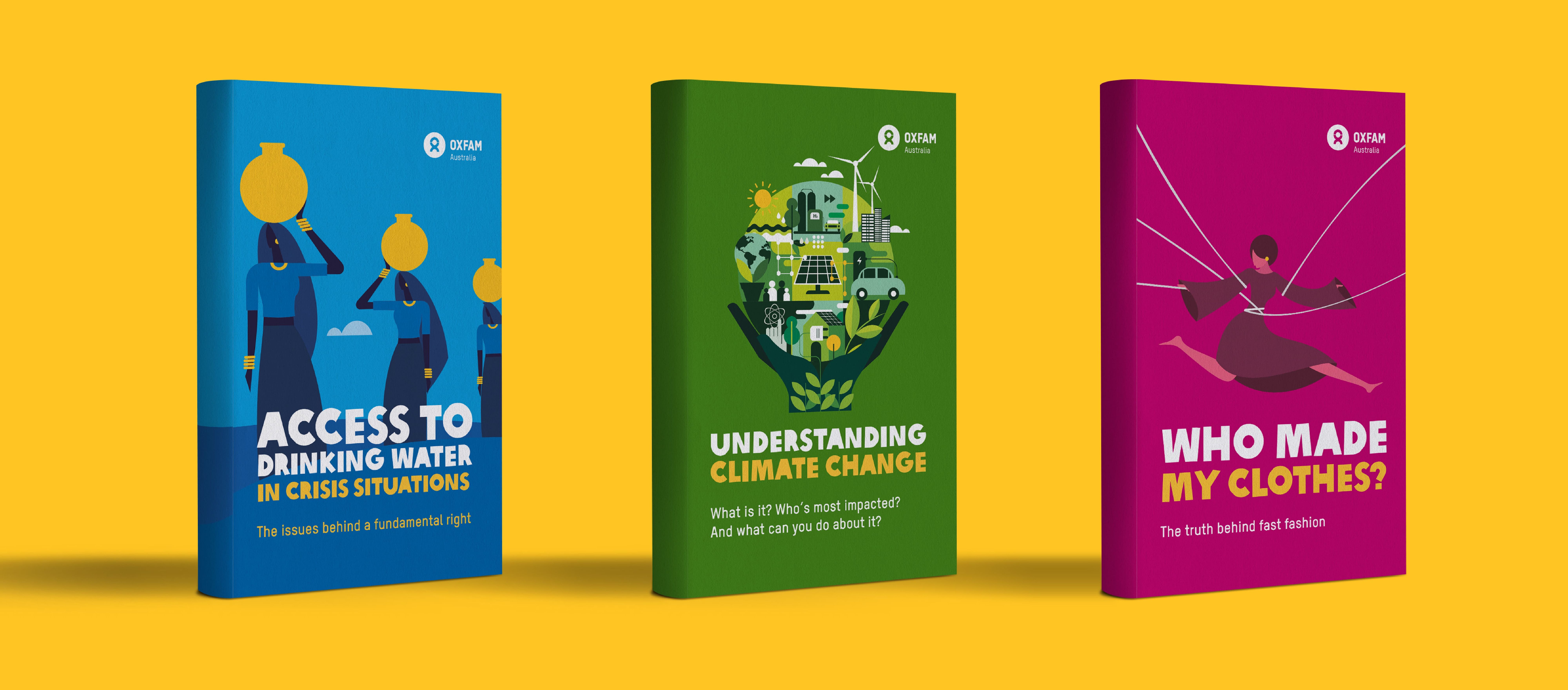
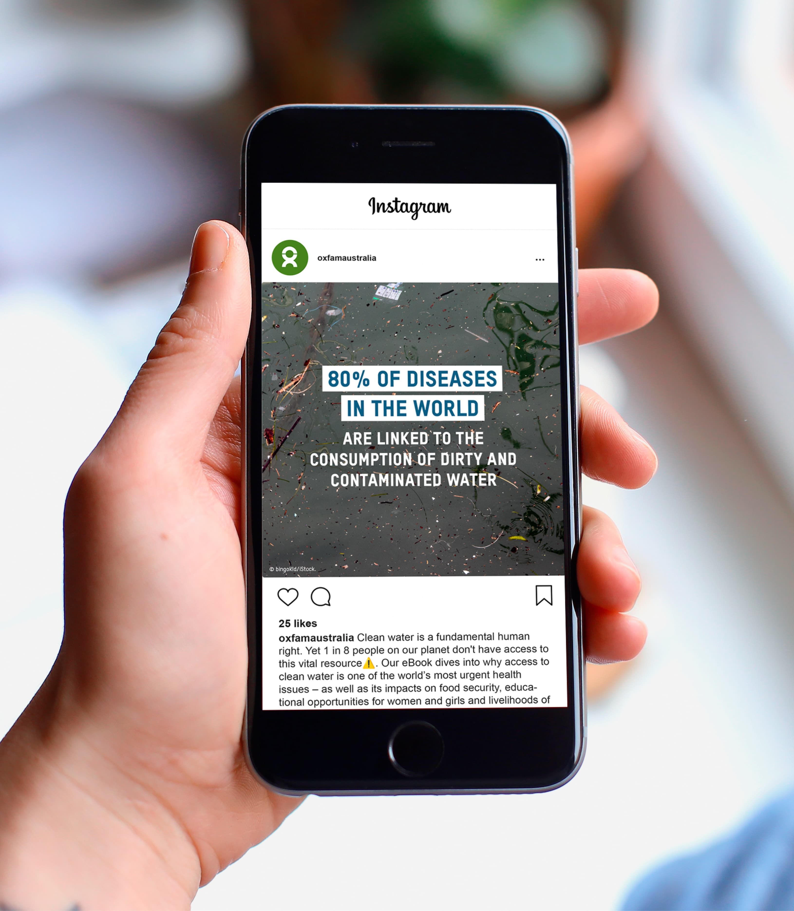
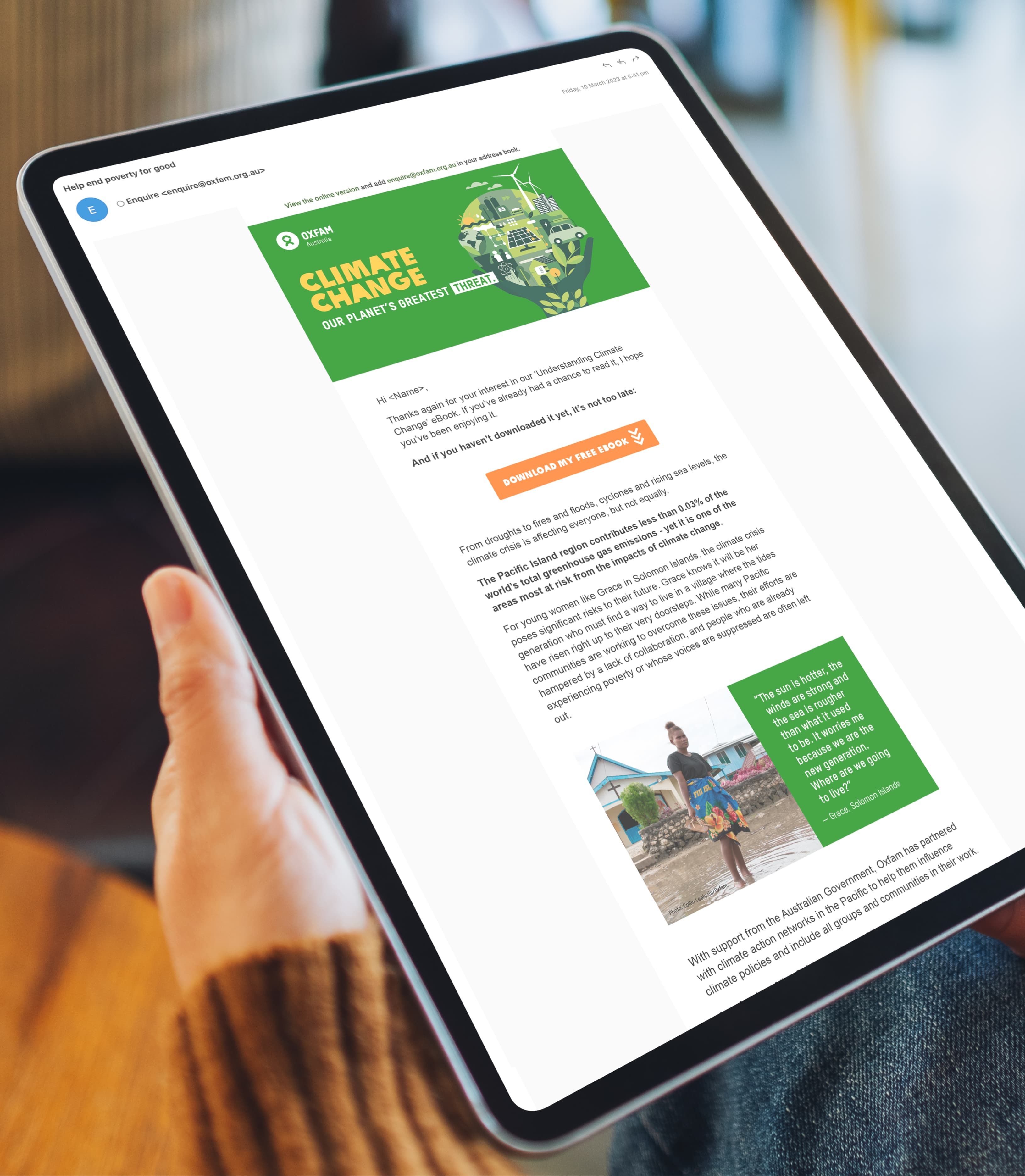
The creative look and feel was inspired by the illustrative approach utilised by the French campaign. Each title was assigned a colour from Oxfam’s signature brand colour palette – blue for WASH, green for Climate change and pink for Fashion. Eye catching and thumb stopping illustrations were developed in these colour palettes to bring each topic to life, and stand out from the largely photographic content on social media. These eye catching illustrations were paired with bold typography and bite sized graphics showcasing statistics. The overall effect was to create multiple access points into the content, allowing readers to easily dip into the topics. Change&Co recrafted the ebook content for a local audience and refined the social media and supporting email messaging for maximum engagement and conversion.
Their team was a delight to work with and we felt the whole process was very collaborative. We wouldn’t hesitate in recommending them to anyone that’s looking to inject some energy into their campaigns.
