Shopfront
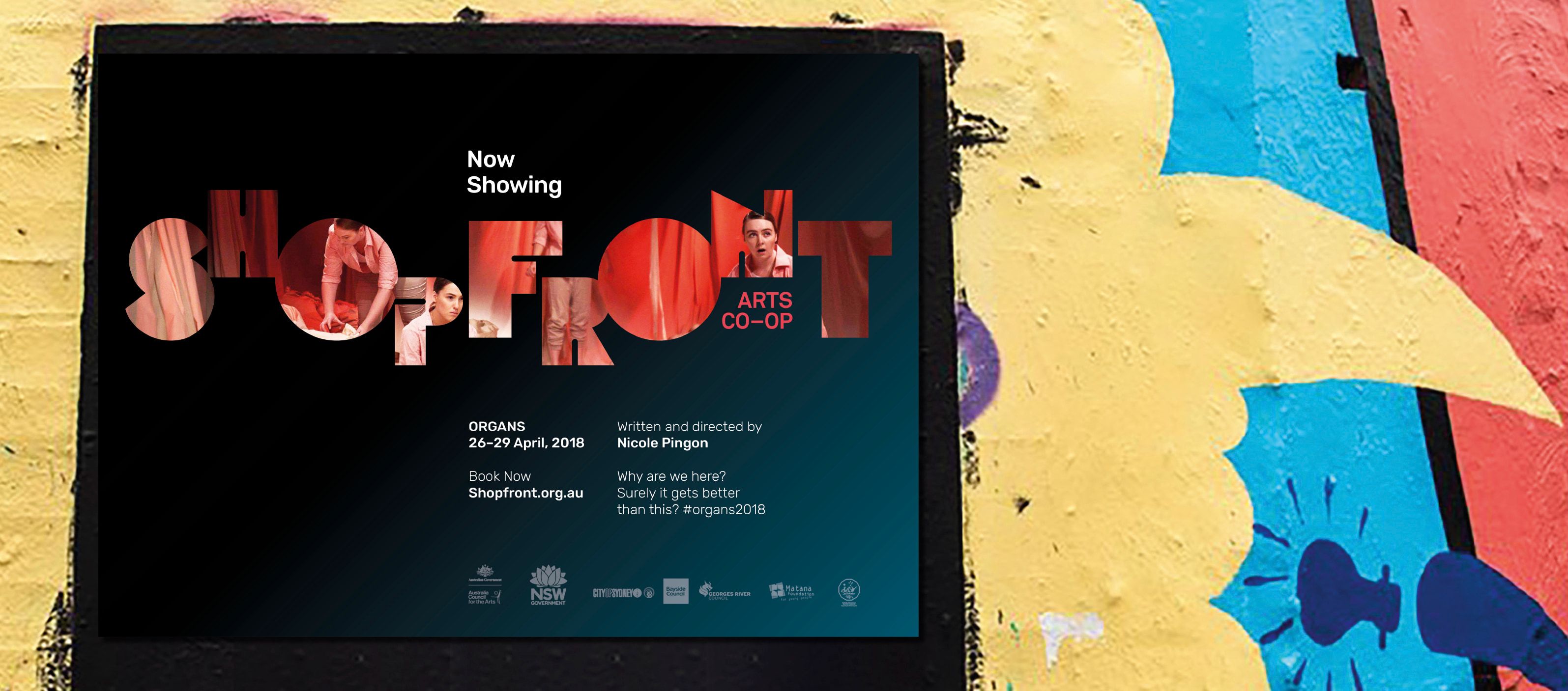
Shopfront Arts Co-op is the home of youth arts. They needed a new identity and consistent look and feel that represented the future of the organisation.
Young people come in all shapes and sizes. This diversity brings with it different perspectives, experiences and abilities – creating a rich Australian cultural landscape. Shopfront amplifies these young voices, creating a space that enables young people to come together to express themselves.
While exploring over four decades of history, interviews and research, we began to ask each other:
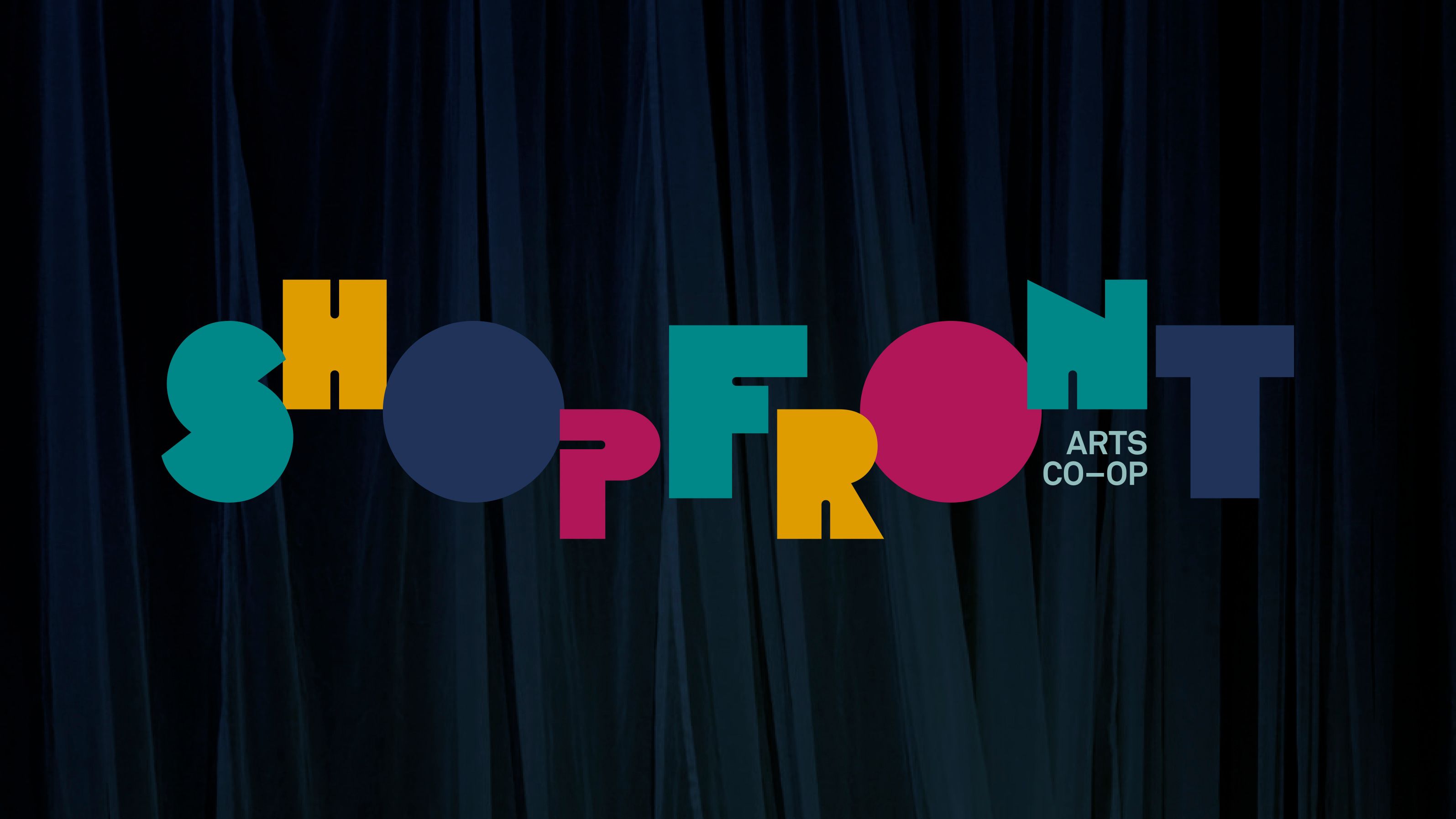
“What if we created a logo like Shopfront creates a stage production?”
The letterforms could represent the members, from all different walks of life. And the arrangement of the letters could reflect the empowering experience of a stage performance. The resulting logo captures the creativity of Shopfront members when performing on stage.
It was a big ask for an agency to work on our unique brand, but Tone really took the time to understand Shopfront Arts Co-Op as an organisation, and genuinely cared about delivering a visual identity that would resonate with our stakeholders, most importantly our young Shopfront members.
We couldn’t be happier with the outcome and our Young People are excited by the fun and distinctive visual identity that we are about to send out to the world. Tone has created a beautiful representation of us as an organisation.
