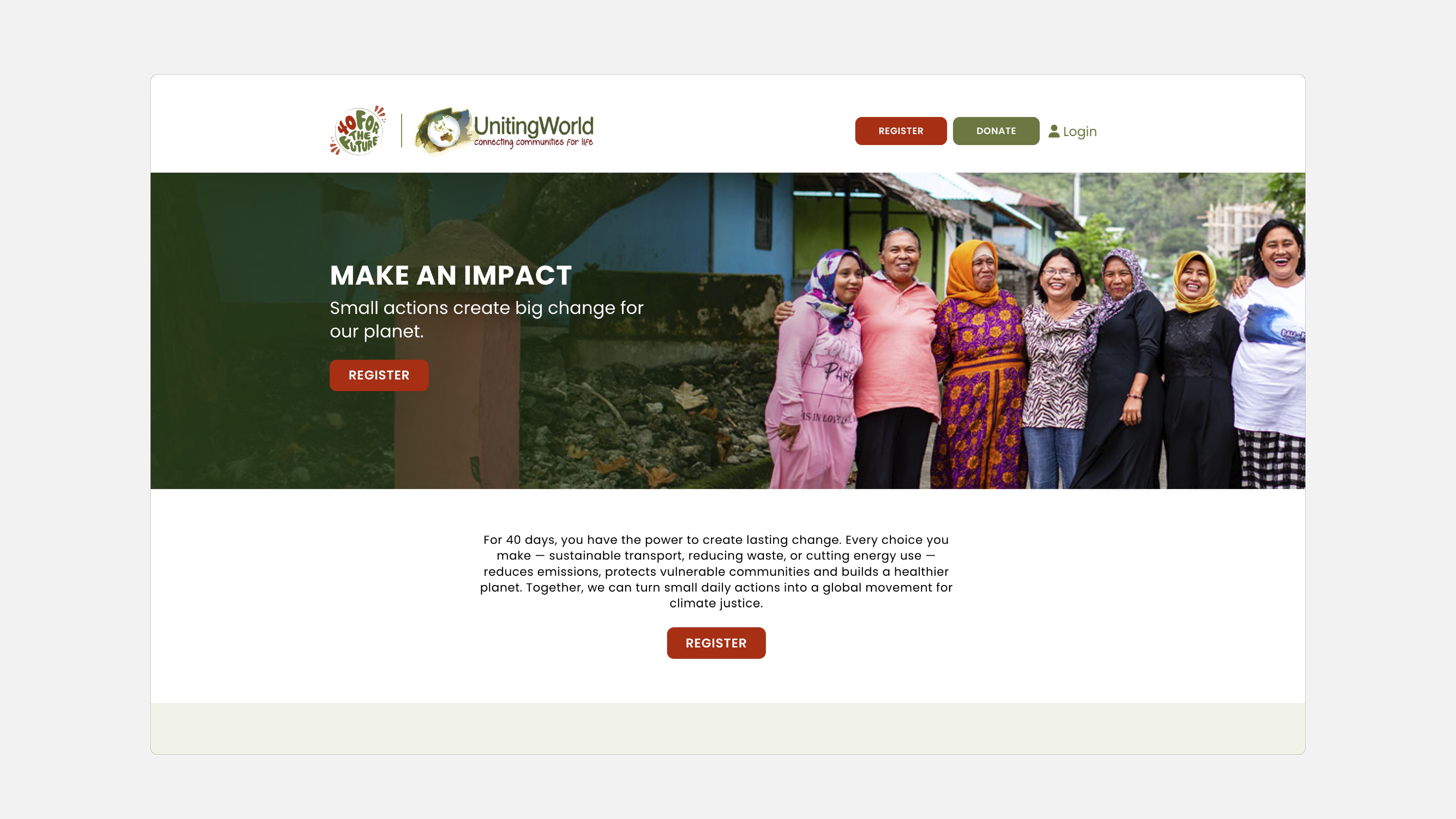
UnitingWorld’s 40 for the Future peer-to-peer event
Our team developed naming and visual identity for UnitingWorld’s community fundraising initiative. The aim was to galvanise supporters, inviting them to take up the challenge with a rousing call to action. It served as a reminder that small actions can make a big difference.
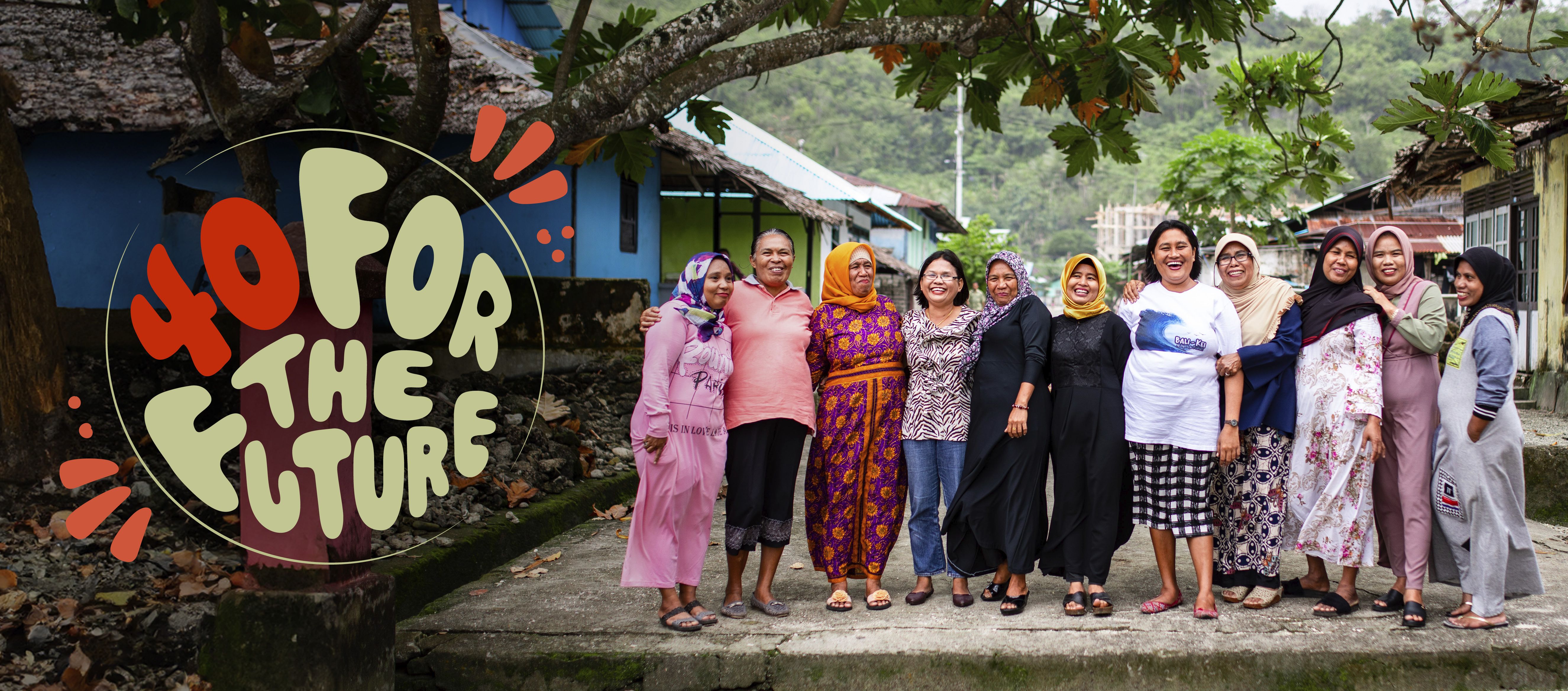
The campaign name – ‘40 for the future’ – offered an emphatic rallying cry to supporters. The alliteration of ‘40’ and ‘future’ ensured a memorable name that rolled off the tongue. It represented the 40 days that donors would make small changes for the future of our planet.
The visual design worked to reinvigorate UnitingWorld’s brand. The launch sat alongside their climate-focused brand platform, also developed by our team. The addition of an accent red colour differentiated the campaign. A key aspect of the design was our custom circular campaign lockup with bespoke typeface. A nod to the UnitingWorld logo, it represented the impact of climate change of the future of our world.
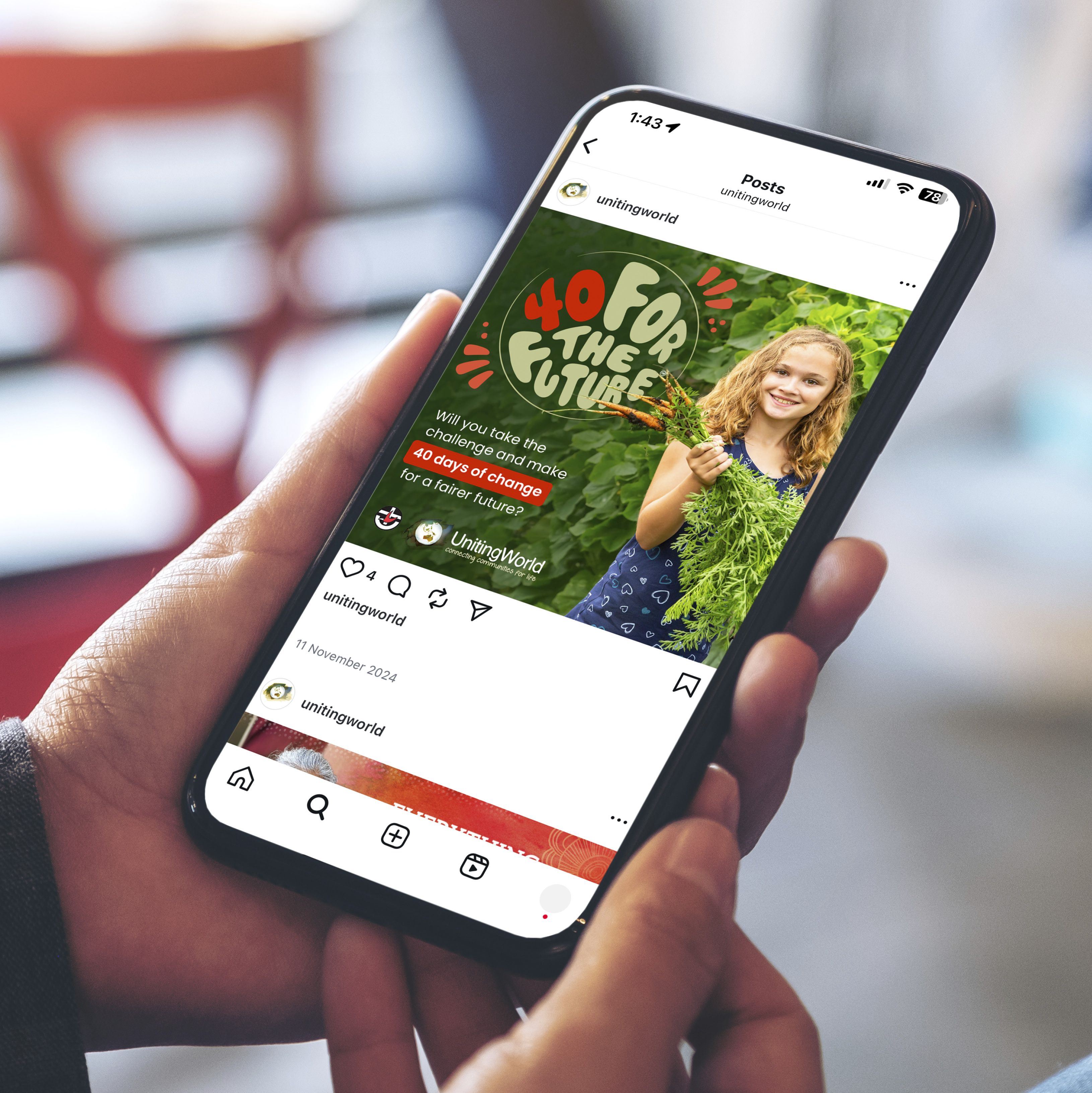
The campaign asked UnitingWorld’s supporters: Will you take the challenge and make 40 days of change for a fairer future?