Change & Co Brand Development
In 2022, we were tasked with rebranding and repositioning our client Heart for Causes. Their existing brand did not align with their new business strategy. Their new brand, Change&Co, needed to support their bigger vision for the company.
Founder Dominique Antarakis explained “The idea is to have plenty of collaborators. You get to work with interesting people, and draw on people’s strengths. With Change&Co, it’s not just our direct partners we’re working with, but there’s also who we align ourselves with.”
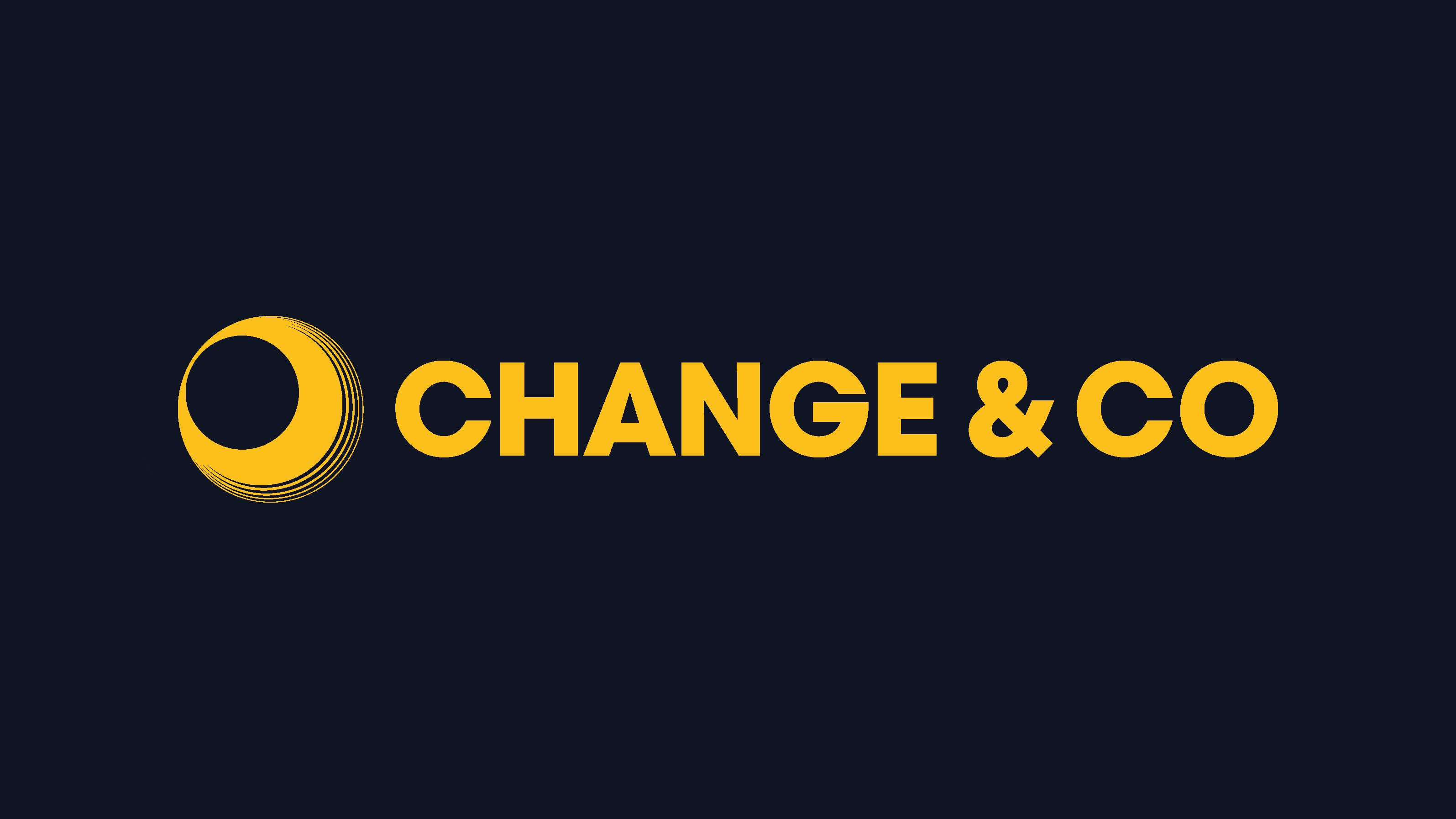
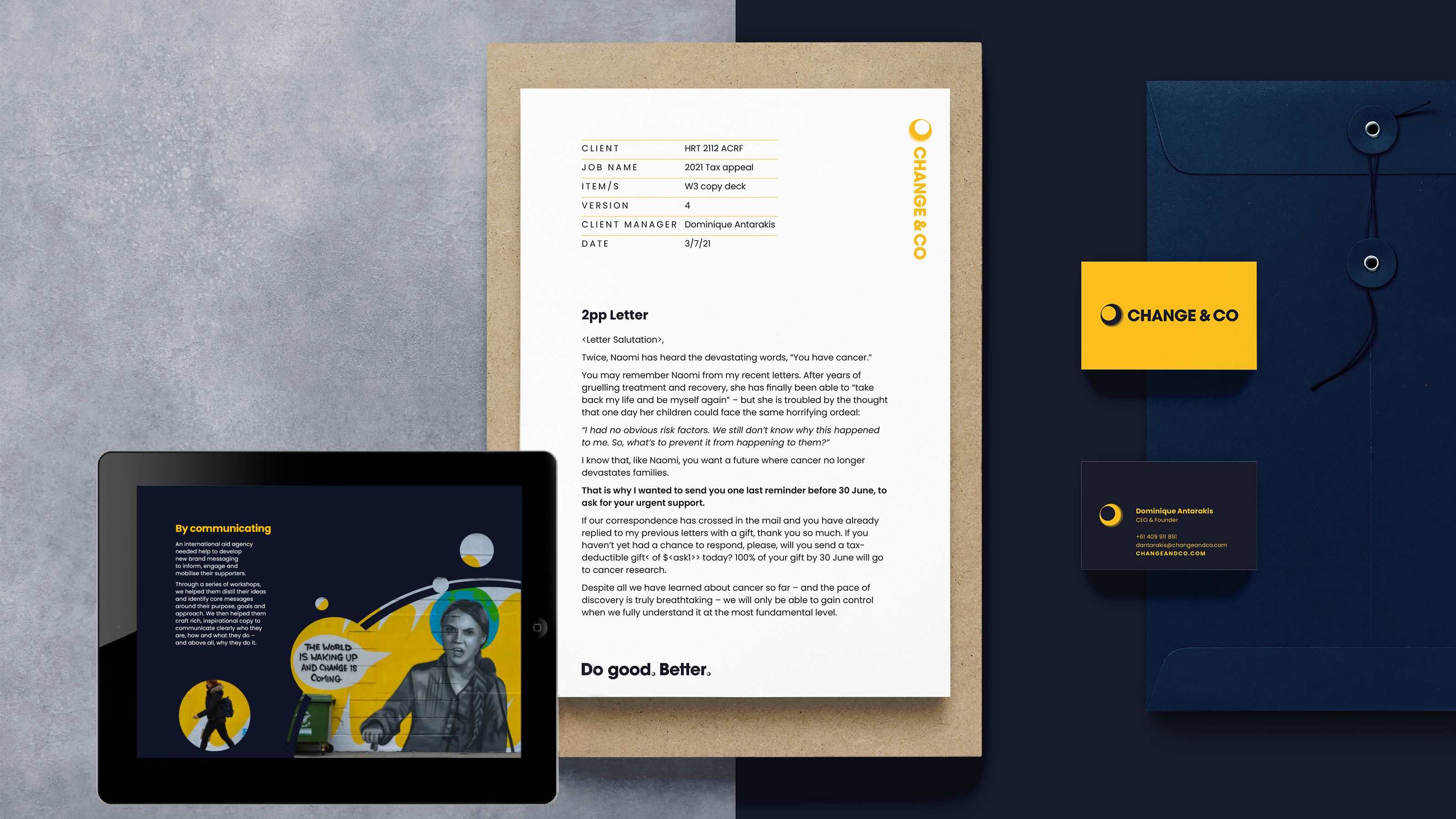
The Change&Co network is made up of Makers, Guides and Communicators. Honing in on these three key players is where the visual identity was born. The Change&Co “network” is visually represented using circular graphics in the logo. The overall effect is of a dynamic ecosystem of moving parts and ideas. Like a news network, their accompanying communications needed to be authoritative. Therefore, use of highly legible and classic typography, and bold use of colour were the key ingredients for this new network brand.
For the website, we elevated the client’s product, (the copywriting), to be the hero. The home page gives a sense of arrival – of this new, (exciting), company of change agents for good.

The idea for rebranding my business to Change&Co had been brewing for a while. When it came time to think about the look and feel, Tone Studio was the obvious choice for the work. They helped me clarify the direction and purpose of the company and produced two outstanding concepts, either of which I would have been happy to move ahead with. I’m totally in love with the new logo, tagline and colour palette.
