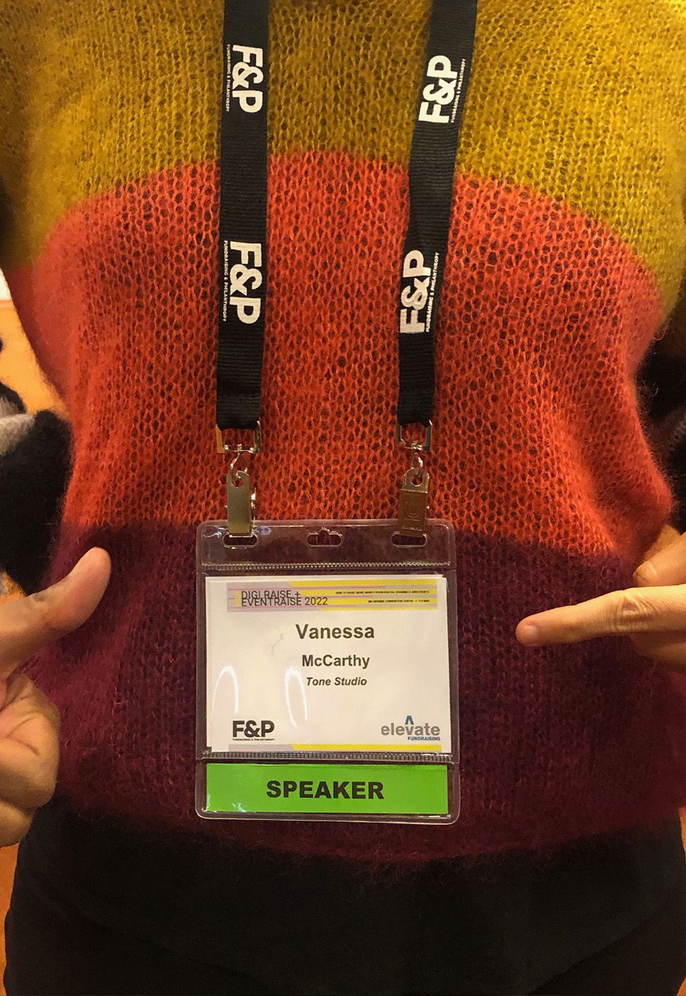
During part of my talk, I shared the top 5 tips our studio uses to develop digital creative that moves donors to act. I call these tips, but they are serious, tried, and tested techniques we use at Tone every day. I thought I’d share them here as well.
1. Start with a great idea
The average attention span for a goldfish is nine seconds, according to a study from Microsoft highlighting the effects of a modern, digitalised lifestyle on our brain. Since the year 2000, the average attention has span dropped from 12 seconds to eight seconds. So, if you’re going to create a campaign that captures even the shortest attention span, and move your donors to act, you’ve got to put the time and the thinking into it. Advertising legend David Ogilvy famously said:
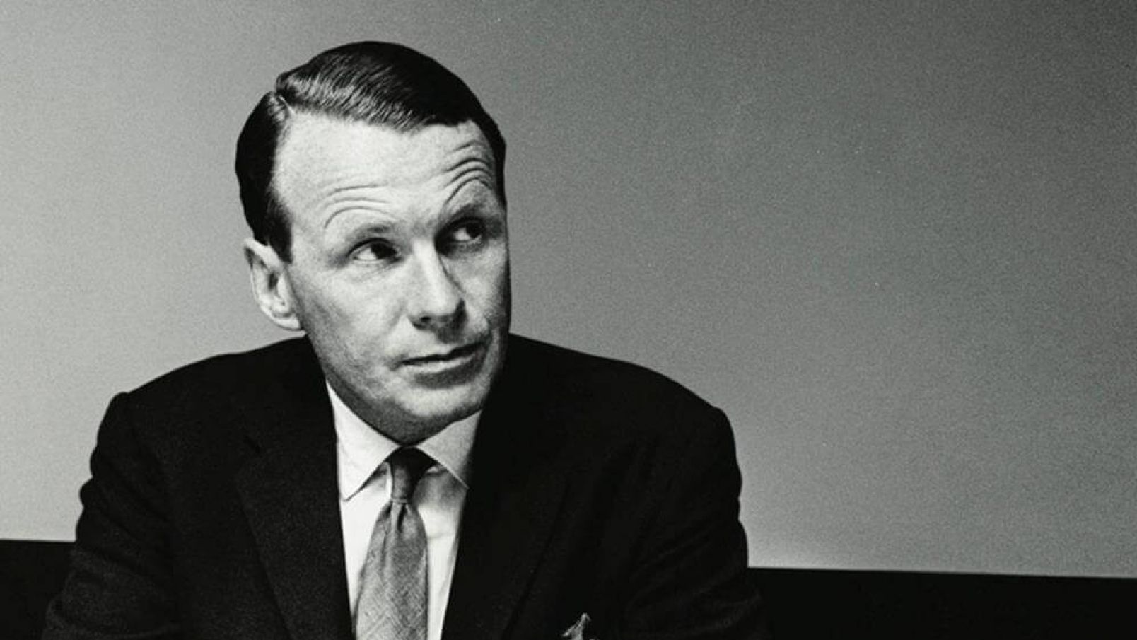
DAVID OGILVY, IMAGE © OGILVY & MATHER

“It takes a big idea to attract the attention of consumers and get them to buy your product.
Unless your advertising contains a big idea, it will pass like a ship in the night.”
2: Communicate the need
You must ensure the “need” is clear. Think about how you can do this in the most effective and efficient way with your donors. You will obviously do this with your messaging and imagery, (if it’s available), and then you could think about appealing on an emotional level. Or it could be a rational approach, using statistics or evidence to support your cause. You can use colour or graphic devices to evoke a sense of urgency. Strong creative, such as this HTML5 Display banner for UNICEF‘s Tax Appeal, back in 2017, used a combination of these tactics.
Just like this creative, ensure the need is clear so that donors are ready and willing to respond to your ask. Because being very upfront with donors about the need is always a great place to start.
Tip 3: Connect on a human level
This is a personal favourite of mine. I’ve got another UNICEF example here to show you. This was for a 2020 Mother’s Day campaign highlighting the importance of a newborn being protected and cared for by their mother. When I say connect on a human level, I mean it would be very difficult for anyone, any human, to dispute the importance of making sure that a newborn gets the care it needs from its mother.
Our concept design drew on the connection of wrapping gifts for Mother’s Day, and wrapping newborn babies in the bright, patterned swaddlings of the two tied countries we were raising money for – Vanuatu and Zimbabwe. We selected real hero imagery that was a perfect representation of maternal protection and connection, adding authenticity. And injected some colour from patterned textiles from real Kangaroo Care wraps. We also added a heartbeat animation to emulate mother and baby breathing in sync – the essence of Kangaroo Care.
Tip 4: You need to make an impact, no matter the channel
Are you just doing posts on Facebook – or Instagram and Tiktok too? Will your creative be on YouTube and LinkedIn? Does your creative need to extend to display advertising because you want to remarket to some of the audiences you’ve created from previous campaigns? Will your creative support any distress advertising opportunities that come up?
For this MSF project, we had to do something eye catching to break through a very saturated news cycle during the start of the COVID-19 pandemic. We went for striking black and white creative that “spread” across the screen like a virus.
The challenge was also to ensure all the HTML5 display banner creative looked great no matter whether it was a horizontal banner or an MREC on a mobile, or a leaderboard or a half page or tower on a desktop. Or a webpage takeover. Or a video on YouTube or Facebook. Your image selection and messaging need to work across ALL formats.
See the full case study here.
Tip 5: The Double Take.
WARNING: Executing this well is not easy, and you’ll know when you’ve got it right. But just be careful. What do I mean by a “double take?” It’s a delayed reaction after an initial failure to notice anything unusual. But once the viewer has done a double take, you’ve got them. Because they will want to know more.
In 2021, we were privileged to work with the awesome team at Lifeline Australia. For this campaign, we used two design techniques to bring mental health front and centre at Christmas.
The proposed Key Art took the form of a festive Christmas wreath on a front door. We wanted to link the creative back to the home, as this is typically where people can feel most alone over Christmas – who really knows what happens behind closed doors? We also wanted the creative to feel personal, and intimate.
While a Christmas wreath would typically have Merry Christmas nestled within the foliage, instead we had an ornate, sparkling “Mental Health” in its place. The intention was to make viewers do a double take, and then investigate further.
The design had to work very hard to create a natural familiarity around the Merry Christmas messaging, so that the viewer saw “Merry Christmas” but read “mental health.”
We also tapped into a nostalgic Christmas aesthetic. And this insight came from WGSN, the trend forecasters. “Nostalgia is a fundamental human emotion and has been very much on people’s minds during the pandemic and over the past year of lockdowns. Such a big part of nostalgia is creating comfort. People are longing for this analogue time where you could switch off.”
See the full case study here.
All the best with your next digital campaign. The team at Tone will continue to wave the design flag – we hope you do too.