At Tone, we’ve dedicated the last few years to honing our image-making abilities, particularly in the creation of compelling Key Visuals.1
One of the things you need to appreciate to do this kind of work, is the power of the images you have the privilege of using (or creating). There’s a real energy associated with a good image. The skill is how you harness or use that power to create an impact.
The power of photography
This editorial photograph stopped me in my tracks when I first saw it at a World Press Photo Exhibition in Sydney many years ago.
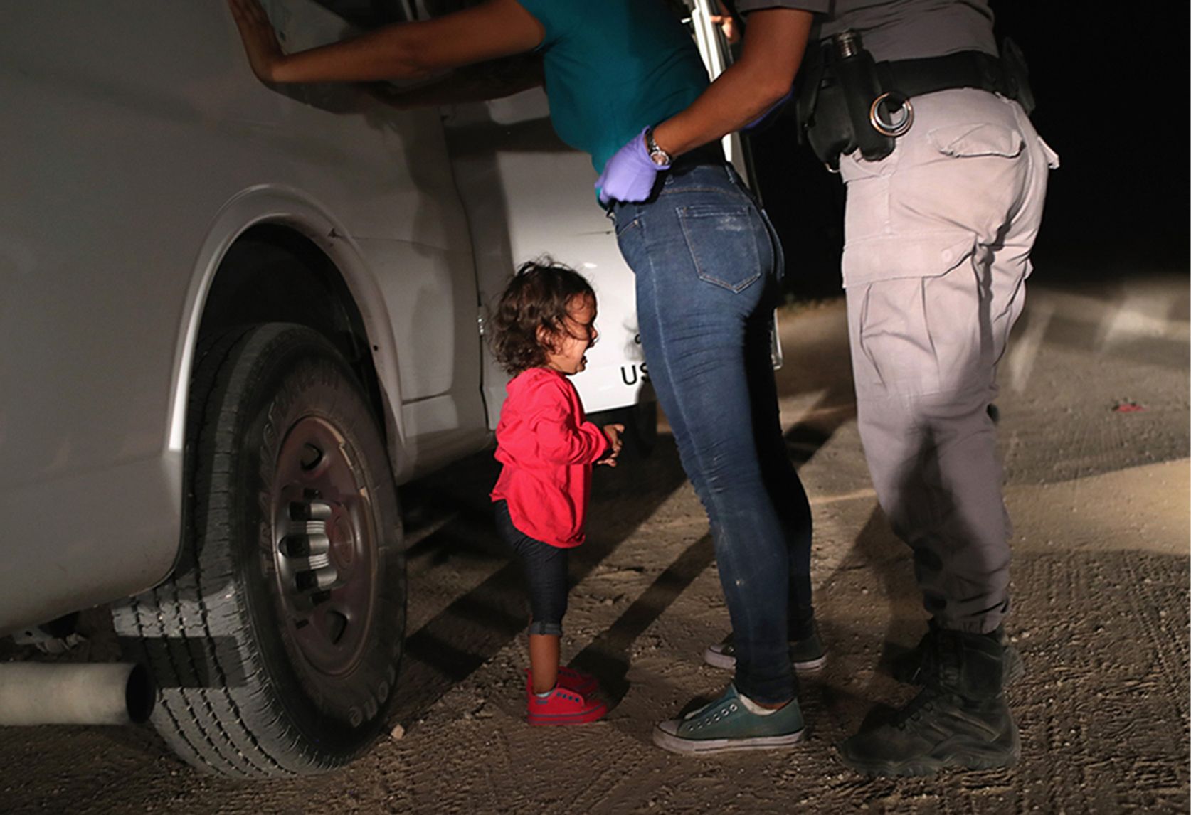
CRYING GIRL ON THE BORDER BY JOHN MOORE © GETTY IMAGES
Called Crying Girl on the Border, it was taken by photojournalist John Moore in Texas USA on 12 June 2018. The publication of this photograph, which captured the controversial family separations resulting from President Trump’s “zero tolerance” policy, sparked public outrage that ultimately led to the policy’s reversal eight days later.
Why is this image so powerful?
For me, you’re immediately drawn to the child as she’s highlighted in red – emphasising the cruelty of a policy where immigrants caught entering the US were separated from their children. The juxtaposition of her tiny frame with the scale of the adults’ legs makes her look even more vulnerable. The adult’s heads are cropped off, which adds a further sense of drama and intrigue. The mother’s hands are against the car – she can’t comfort her child. And the rubber gloves, boots and pepper spray on the border agent add a menacing, authoritarian feel. The gravel road, the tire tracks and the harsh light of the car headlights let you know that you’re somewhere deserted. It’s isolated and it’s scary.
All these subtle cues – the framing, the lighting, the composition – they add up and create this tension. You can feel the emotion in the image.
These real and often heartbreaking moments in life are so rich and detailed. But, like John Moore, you must be there to capture them. Which is difficult, and often, impossible.
What if you lack compelling real-life imagery for your campaign?
This can occur when we work with some of our not-for-profit clients. And often, when dealing with issues relating to children, we are required to cast talent and de-identify key details of a story to protect the child’s right to privacy.
Imagery in the not-for-profit sector has undergone a major transformation in the last 5-10 years. We’ve moved away from exploitative depictions, often referred to as “poverty porn,” towards more respectful and empowering visuals.
A charity client and I recently discussed the importance of ethical storytelling. He articulated the goal perfectly: “If someone sees their story in our brochure or on social media, they should feel proud, not ashamed.”

And that’s our job as communicators and fundraising designers. We must find that balance between being respectful to people who’ve bravely shared their stories, but also showing need for the cause, while still creating a deep connection so the viewer acts – donating, signing a petition, or even just changing their behaviour.
As a studio we’ve had to train ourselves to ensure the images we use, and the way subjects are portrayed have agency.
Crafting a Key Visual
In 2023, Tone started working with The Smith Family on their imagery, to support their objective of reframing how poverty was depicted in their communications. Our job was to create imagery and campaigns where the children portrayed looked more empowered and determined, instead of isolated and afraid.
The following Key Visuals for the 2023 Winter Appeal were inspired by the story of Nic, an Australian boy who loved maths and wanted to be an astronaut when he grew up. We were incredibly moved by the sheer injustice of a situation where a smart, determined child like Nic, with a supportive family, was being prevented from achieving their best at school because of poverty.
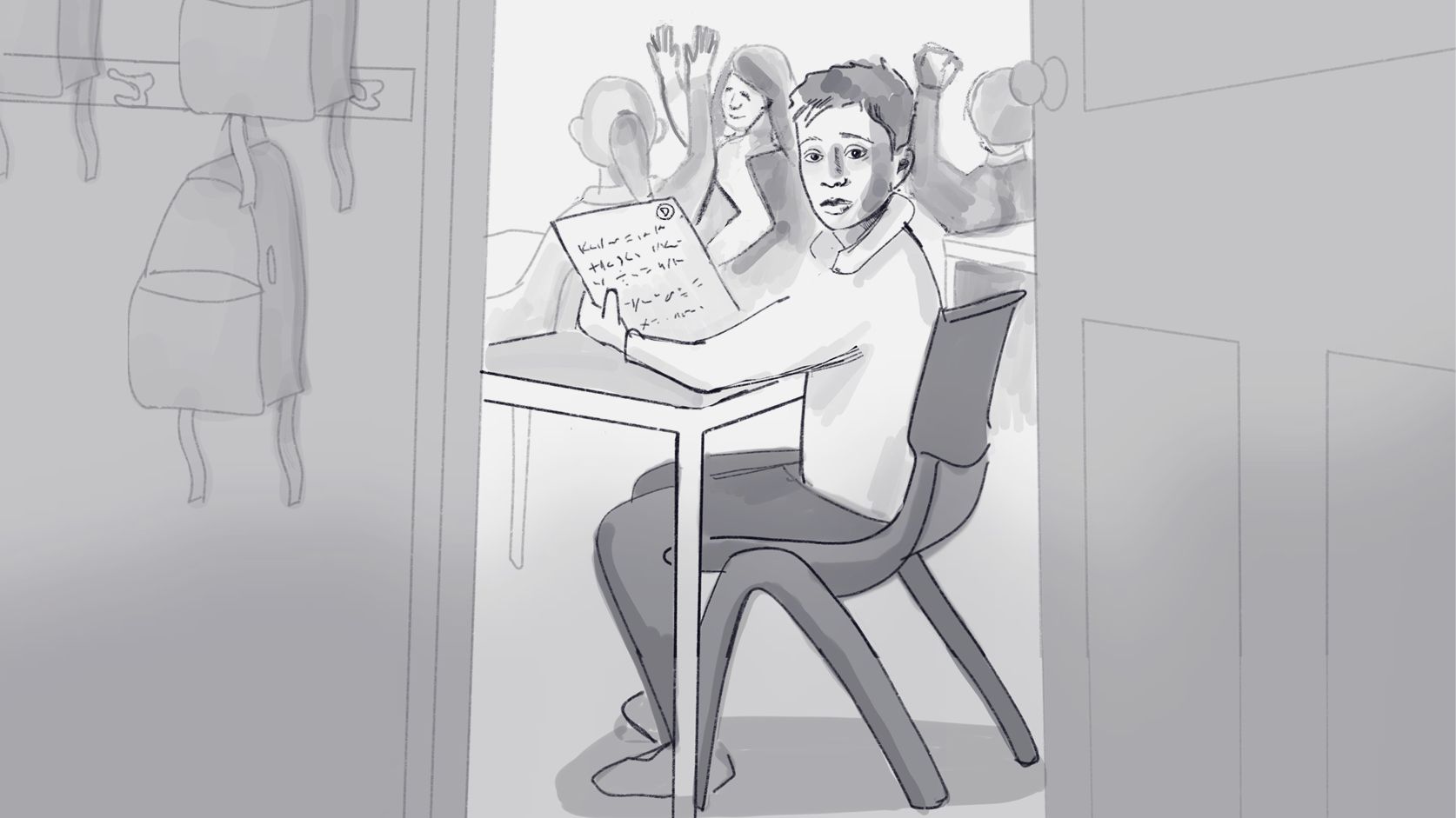
IMAGE © TONE STUDIO
We shot this Key Visual in a local primary school with realistic props and casting to add authenticity. That’s what I spoke about earlier when we were looking at John Moore’s image from Texas. All these subtle cues and details add up to make an authentic image and add context.
We’re looking in on this boy’s life, and capturing this moment in his day when he receives his test results and he realises, even though he’s trying so hard, he’s falling behind his classmates, and his dreams are slipping away.
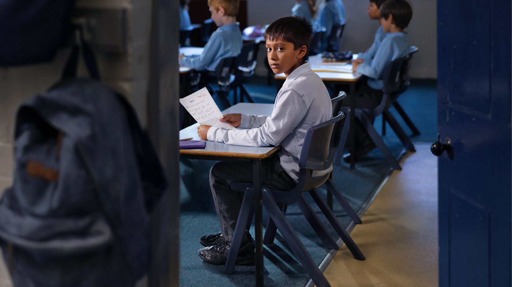
IMAGE © TONE STUDIO
But if you look very closely at his facial expression,
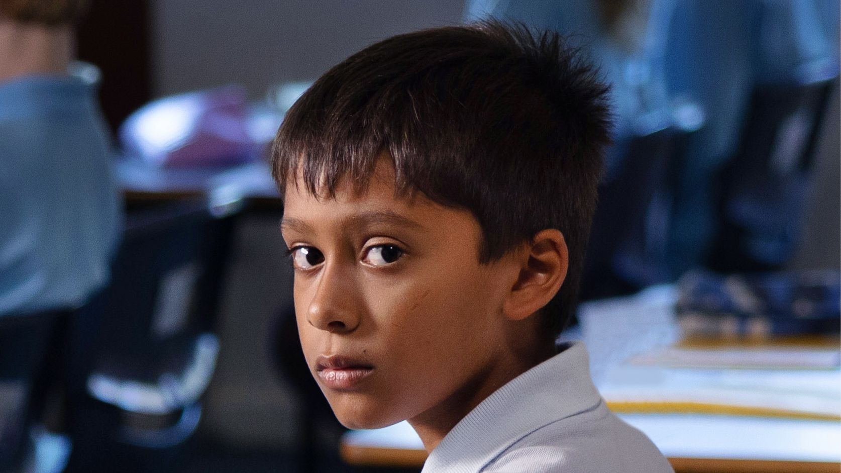
IMAGE © TONE STUDIO
a significant amount of care has been taken to ensure he personifies the brand’s objectives of portraying poverty in a dignified way. He’s still determined to work hard and achieve. He’s slightly disappointed but he’s not afraid. The real issue is not his effort, it’s that poverty is stopping him achieving all he’s worked for.
That’s a skill to creating a Key Visual – getting all that information and detail in one key frame, so that when someone walks (or scrolls) past, they think hey – this doesn’t add up. We’re a wealthy country with a good public school system, why should anyone be left behind due to their financial situation? And what can I do to help?
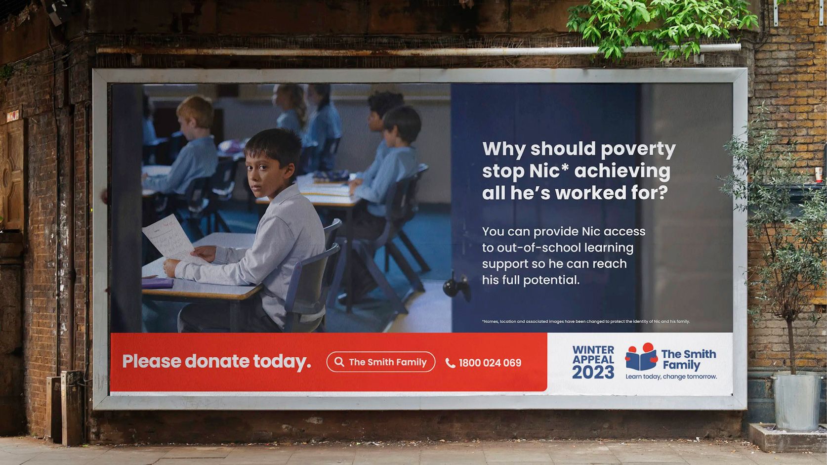
IMAGE © TONE STUDIO
The skilful use of ‘closeness’ or proximity to a subject in photography, is essential for enhancing viewer engagement and creating a more immersive experience.
Let’s look at the science of proximity
Proximity was written about by cultural anthropologist Edward T Hall. Dr Hall defined human’s use of space in simple terms:
Public space – in the outer green ring, is more than 12 feet away (3.6 metres) from others.
Social space – in the inner green ring: from 1.2 to 3.6 metres – is for interactions among acquaintances.
Personal space – in the orange ring: 0.45 – 1.2 metres – is for interactions among close friends or family.
And Intimate space – the red ring is for anything closer – for embracing, touching or whispering.
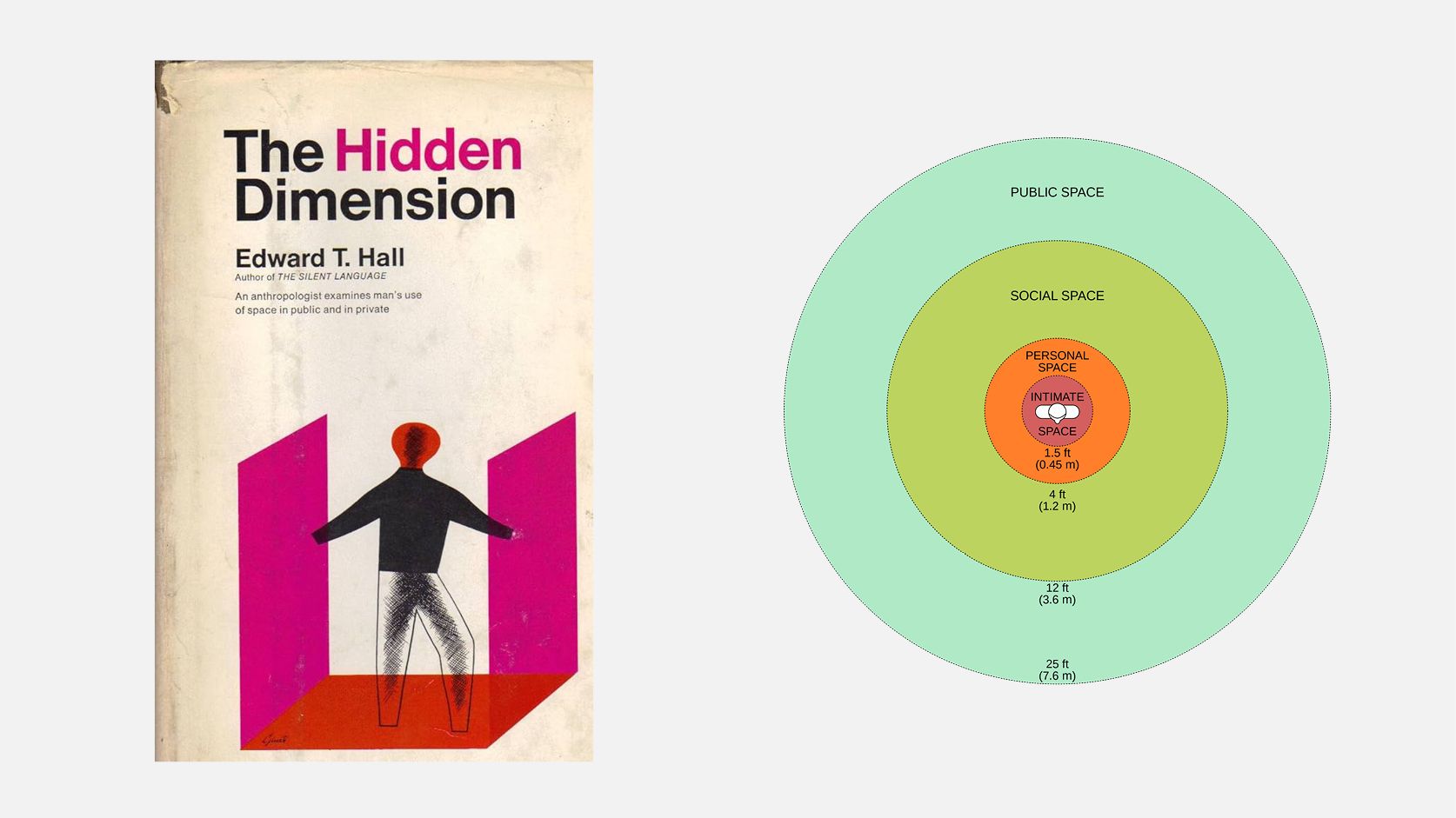
A CHART DEPICTING EDWARD T. HALL'S INTERPERSONAL DISTANCES OF MAN, SHOWING GRADUATIONS IN FEET AND METRES © WIKIPEDIA
As humans, we’re wired to have emotionally significant responses to people we’re physically closer to. We can’t help it – it’s biological. When we use the technique of proximity in our Key Visuals, we are recreating this sense of closeness with our viewers. We can build a stronger emotional connection between our subject and the viewer, (a potential donor), when we reduce the space between them, which is vital for fundraising.
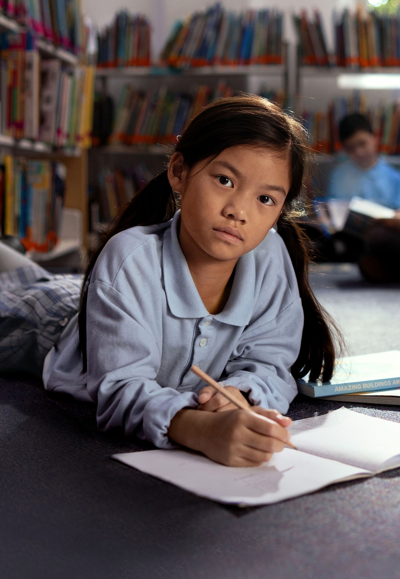
Here’s another example for The Smith Family, using this technique. Let me set the scene for you:
Working on her maths homework on the library floor before school, Leah’s focus is absolute. Her direct gaze communicates a powerful drive to succeed, a determination born perhaps from the challenges hinted at by her worn uniform and scuffed shoes. There’s a quiet strength in her posture, yet a touch of vulnerability suggests she’s still finding her confidence.
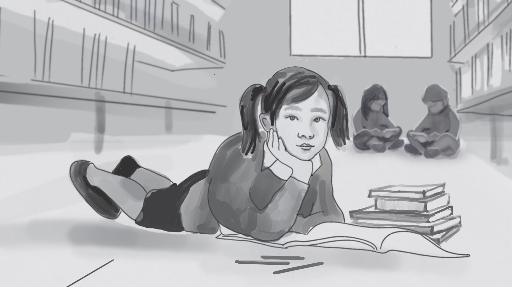
IMAGE © TONE STUDIO
And this was the final Key Visual that brought Leah’s story to life:

IMAGE © TONE STUDIO
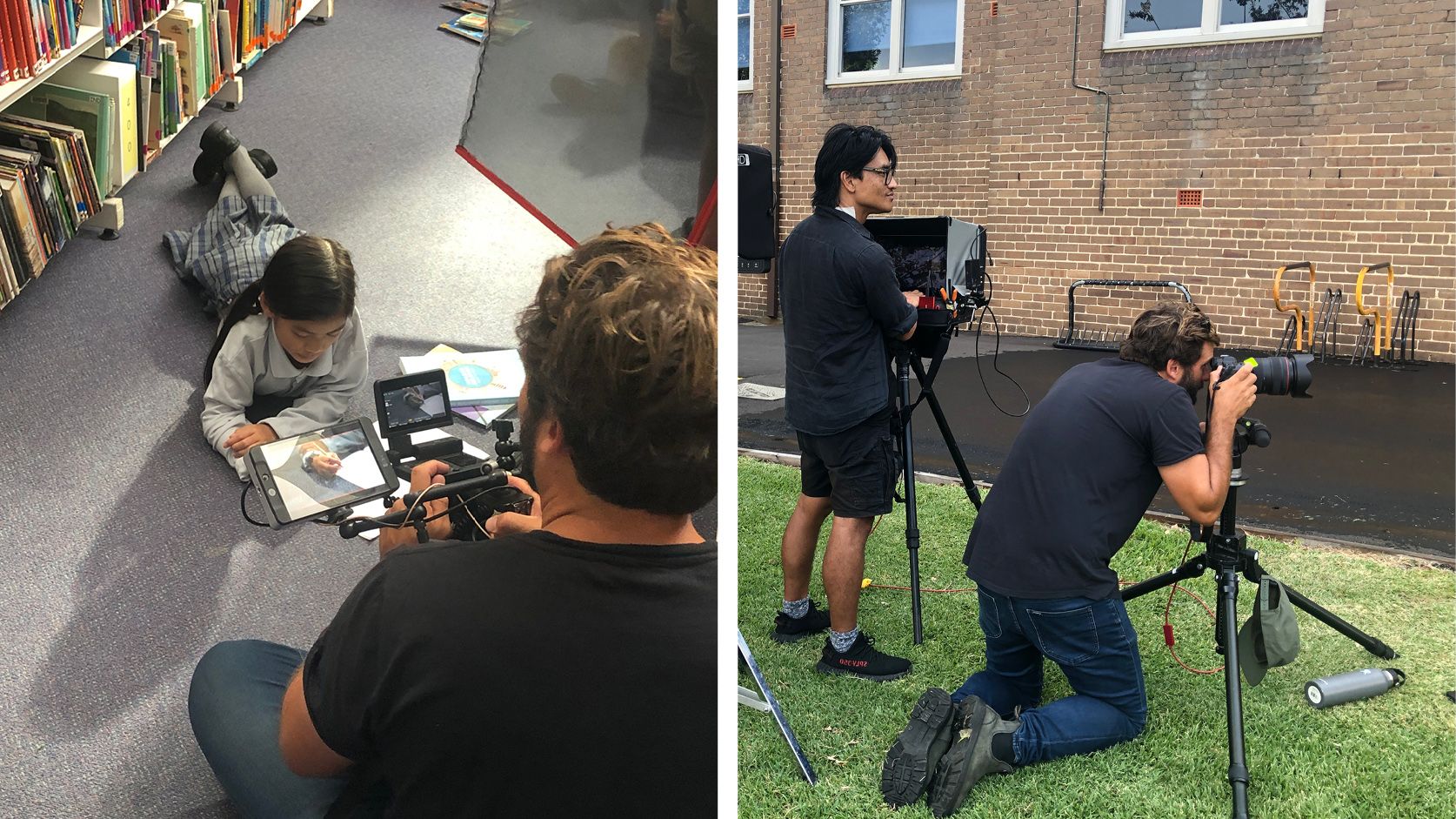
The key visual depicts Leah on the floor, a deliberate choice to visually communicate the challenges she faces studying without adequate space at home. To take this kind of shot, using “personal distance” from Dr Hall’s theory, you can see how intimate it is. The photographer, the incredible Toby Dixon, was literally lying on the floor for a lot of the shoot to achieve this framing.
Just by getting in so close and changing perspective, the level of engagement you get from looking at this image is increased. The results spoke for themselves: this was The Smith Family’s most successful Winter Appeal to date. Which means they can reach even more children and help reduce educational inequality in Australia.

IMAGE © TONE STUDIO
Good design works.
When you think deeply about your craft. When you use design principles, science, or even your gut feeling – it makes a difference.
You can learn more about these projects by visiting our website case study page here. If you’re interested in learning about the incredible life-changing work of The Smith family, head here.