For those of you who missed the conference, here’s a brief recap of some of the highlights, with some additional detail on the design decisions I made to ensure the creative connected with Australian donors. And if the following fundraising problems sound familiar, you’re not alone.
Problem #1: There’s something massive happening and you’re not part of it.
Now imagine you’re smack bang in the middle of the lockdown due to COVID-19, and everyone else is going out with emergency appeals.

For the 2020 Fred Hollows Foundation’s Tax Appeal, it was our job to remind their donors that human dignity is universal, and that no one can be left behind.
Our appeal went back to one story, about one child – a girl called Night in Kenya, who had blinding cataract in each eye. The appeal outer envelope (pictured below) is the first thing a donor sees, so image selection must be very intentional. I used an intimate crop to remove any barrier between Night and readers, so her cataract is visible. With everything going on in the world, I think this was a very brave choice for our clients to make.
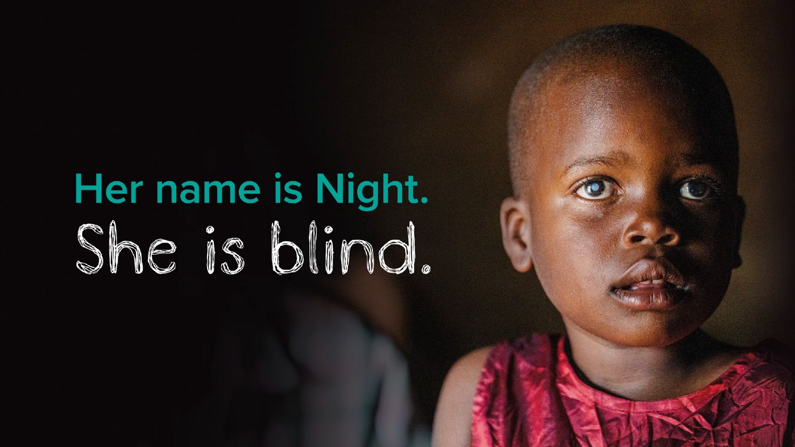
WAVE 1 OUTER ENVELOPE, 2020 FRED HOLLOWS FOUNDATION’S TAX APPEAL. PHOTOGRAPHY BY MICHAEL AMENDOLIA © TONE STUDIO
Key insight:
Go back to your core values and remind people why they supported you in the first place.
Problem #2: You don’t have enough content or budget… or both!
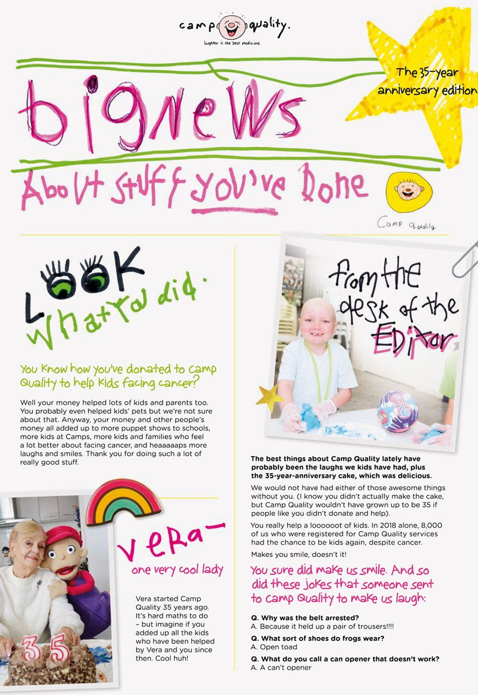
Camp Quality needed to produce a very economical “Donor Care” mailing for the start of the year. The imagery and content were quite spartan, yet the team wanted to ensure it was still a good experience for their donors.
One of the beauties of working with a children’s charity is that you can be authentic. I got the textas out and created all the graphics. For the accompanying newsletter, I used the cheap and cheerful format of a newspaper. I reused older images and refreshed them with stickers, hand drawn texta typography and graphics – so it felt like the kids made their own newsletter. I got my camera out and took some selfies of the puppets.
The result was beautifully on brand, and there were opportunities to add charm to the piece where there wouldn’t usually be much. Donors appreciated the playful nature of the pack, and one donor took the time to write in and say:
“Big News was great! Thank you for an easy quick read – it made Camp Quality more real for those of us who are not able to participate or help other than send money. I am a survivor of cancer, so I really feel for those kids.”
2021 CAMP QUALITY DONOR CARE MAILING, REMINDER EDM BANNER © TONE STUDIO
Enjoy your creative. It’s an aspect of your charity fundraising that donors really connect with again and again. If you love it, your donors will too!
To craft great creative with budget and content restraints, you need a skilful creative team who have faced these challenges before.
If you have a great creative team and a good relationship with your printer, you’ll be surprised how far your budget can stretch. Connect your printer and design team – it’s amazing what can happen when they work together.
Problem #3: It’s the same brief as last time.
It can feel like Groundhog Day when the same brief comes in year on year. But I look on this repetition as a creative challenge to be embraced – because if your creative team are bored, donors will be too. UNICEF’s Inspired Gifts Christmas catalogue is an example where it’s always the same brief as last year. But this time COVID was raging. Children all over the world have had a terrible time, and so possibly have supporters.
So, we had fun – we used the global ‘deliveries’ campaign idea from the Cash Appeal we were working on – and added a reindeer. UNICEF has such a distinctive brand, so we dialled up their signature blue and the presence of their staff in the field and offset that with a truckload of sparkle, so the pack didn’t feel too cold or corporate.

2021 UNICEF INSPIRED GIFTS CAMPAIGN © TONE STUDIO
For the catalogue – I remember being a kid and waiting for the Sydney Royal Easter Show showbag catalogue to come out in the weekend newspaper. That excited feeling of poring over each page, with the big starbursts advertising the prices... It was a ritual I looked forward to each year, and that’s the feeling I wanted to recreate with this year’s catalogue. So that’s what we did – create multiple access points into each page for people to dip in and out, access stories, and smile. And when the client feedback was “MORE GLITTER!” we accepted that challenge head on.
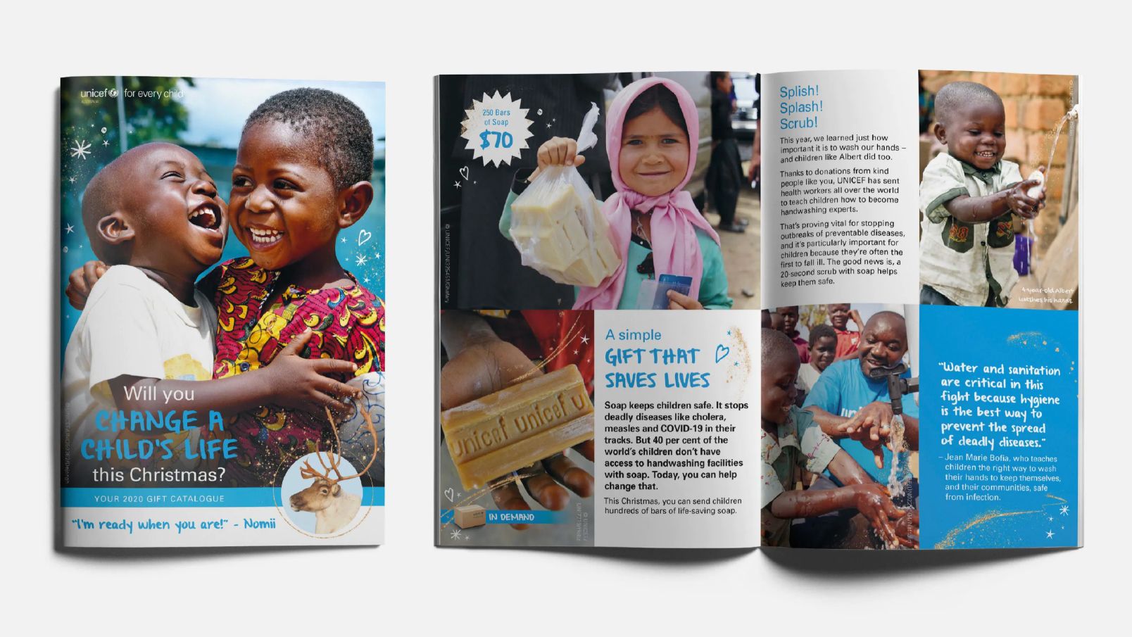
2021 UNICEF INSPIRED GIFTS CAMPAIGN © TONE STUDIO
Because the creative was so different to most of UNICEF’s collateral, the novelty was very attractive to donors. It was playful and fun – and showed how tangible gifts can make a real difference for children across the world.
Our work for UNICEF is a great example of how a strong brand can be an asset. UNICEF is a corporate, global brand who don’t shy away from who they are and what they can do – they lean into their size and global reach of their operations. And that confidence means that when it is time for the brand to flex to soften for donors, it still feels appropriate and “on-brand.”
The catalogue revenue was 32% over target, proving warmth and humour can absolutely work in the right context, even for very big brands like UNICEF.
See the full case study here.
Key insights:
Put the experience of donors first and create multiple access points into your content for a richer experience. This will make the content easier to process, whether they’re a skim reader or read every word in the pack.
Be proud and don’t shy away from using your branding. Your appeals should look distinctive, and you need your design to stand out from the pack and differentiate your cause. Have the confidence to stretch and flex your brand for fundraising. I can guarantee you there’s no glitter in the UNICEF corporate style guide, but it worked!
Find your “hero”. Often, we’ll distil a campaign or appeal down to one hero image and a great call to action that sums up how you want your audience to think, feel and act. The same image can get a donor to open an envelope, or fill out a donation form, or click an online ad. We call this the “Key Art” – that key combination of image and text.
So, there you have it – three very different clients with three different challenges. I hope these tips and insights give you the confidence to harness the power of design in your next appeal.