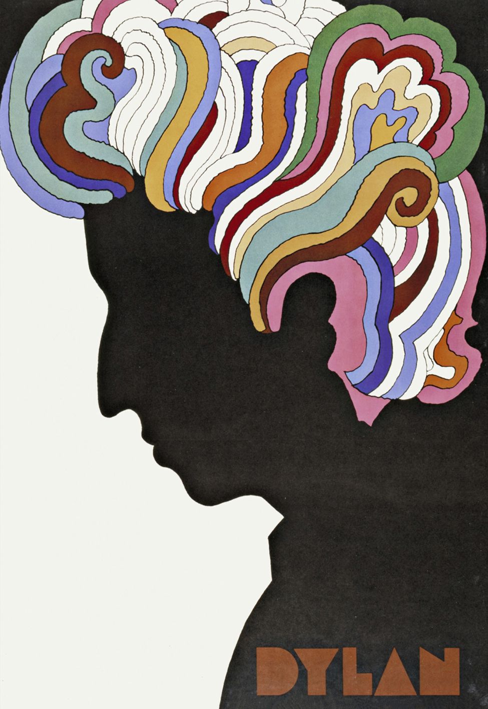
He was the co-founder of New York magazine, the designer of the classic poster included in the Bob Dylan’s Greatest Hits album in 1967, and the creator of the iconic “I ♥ NY” logo.
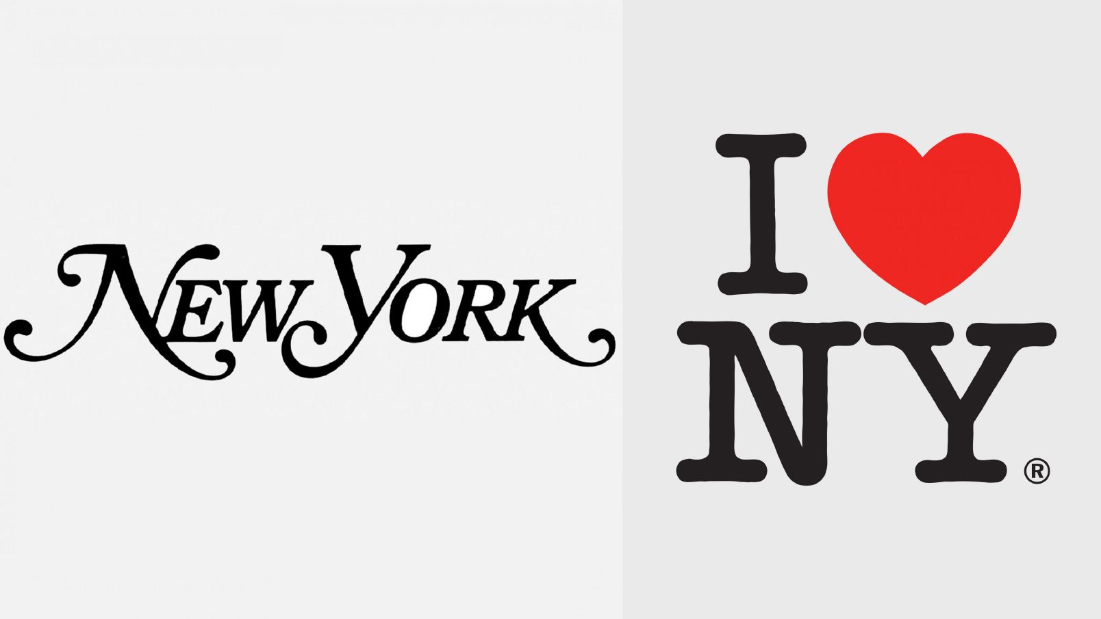
NEW YORKER LOGO, 1968; “I ♥ NY” LOGO, 1977. IMAGES COURTESY OF MILTON GLASER INC.
I first came across Milton’s work as a graphic design student. I was drawn to his psychedelic use of colour in the 60’s. When it came time to starting my own studio, I often looked to Milton’s work for inspiration. It was always brave and uncompromising, with a sense of playfulness that I hoped I could emulate.
A few years back, a brief landed on my desk to design the identity for Shopfront Arts Co-op. Shopfront is a contemporary arts centre where young people come together to express themselves. It was an exciting brief as Shopfront’s young membership would ultimately be voting on their favourite design, to ensure it accurately represented them as a group.After taking a deep dive into the history of the organisation and reading the market research and interviews from its members, I asked the team –
“What if we created a logo like Shopfront creates a stage production?”
The letterforms could represent the members, from all different walks of life. And the arrangement of the letters could reflect the empowering experience of a stage performance. In order to achieve this, I needed a typeface for the logo that captured the diversity and creativity of the Shopfront members.
I needed Milton Glaser’s “Baby Teeth”.
Designed in 1964, Baby Teeth was inspired by a hand painted sign in Mexico City (pictured below left). Milton captioned this original photo with “It’s an advertisement for a tailor. The E was drawn as only someone unfamiliar with the alphabet could have conceived. Yet it is completely legible.”
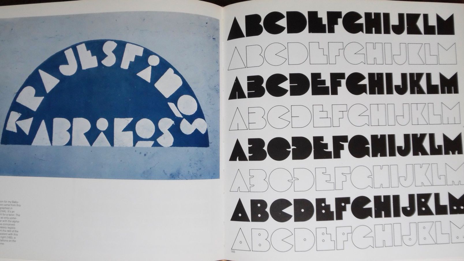
“IT’S AN ADVERTISEMENT FOR A TAILOR. THE E WAS DRAWN AS ONLY SOMEONE UNFAMILIAR WITH THE ALPHABET COULD HAVE CONCEIVED. YET IT IS COMPLETELY LEGIBLE.” - MILTON GLASER
The typeface is a happy accident, an idiosyncratic assortment of shapes that come together to create something beautiful. I knew it would be a perfect for Shopfront.
Shopfront’s Marketing and Communications Manager, Rowena Tuziak, also recognised there was something special about the typeface. “When we first saw it, the final logo spoke to the character of the organisation The typeface has this vivacity, but at the same time, it has a professionalism… everyone loves it.”

For me, this project summed up why I still love design after all these years. Because design that’s been crafted with care can transcend time and cultural barriers.

Just as Milton recognised a beautiful authenticity in the original Mexican signage – our client recognised that over 50 years later, this idiosyncratic typeface perfectly represented an energetic co-operative of young artists in Carlton, Australia. “When we first saw it, the final logo spoke to the character of the organisation. Our young members have already taken ownership of the logo and have completely embraced it.”
See the full case study here.