These past few weeks I’ve been dipping in and out of Michael Bierut’s “How to use graphic design to sell things, explain things, make things look better, make people laugh, make people cry, and (every once in a while) change the world.”
It’s a much-needed bit of escapism from everything going on in the world – with thoughtful anecdotes and diverse case studies from Michael’s career.
I just finished his chapter on logotypes and symbols, it really struck a chord with me:

“When we look at a well-known logo, what we perceive isn’t just a word or an image or an abstract form, but a world of associations that have accrued over time.
As a result, people forget that a brand-new logo seldom means a thing. It is an empty vessel awaiting the meaning that will be poured into it by history and experience.”

What Michael has summed up here is the crucial point in any branding project, where something new is revealed – and it takes a helluva lot of courage for a client to embrace a proposed mark, and then take ownership of it and bring the new identity to life. Because when they see a new visual identity it has no history or brand equity... yet.
I remember seeing an interview with Michael where he expanded on this idea even further:
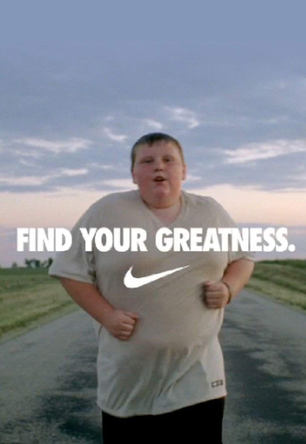
“As a designer, people come to me and they’ll say “Oh, I want something like the Nike swoosh.” They think that the Nike swoosh was the Nike swoosh the day it was drawn. It was nothing the day it was drawn. It wasn’t until they started putting it on the sides of shoes, and the shoes were good... and then the genius of Nike’s marketing apparatus made us further associate that product not merely with performance athletic gear, but with the very idea of athletic achievement itself.”
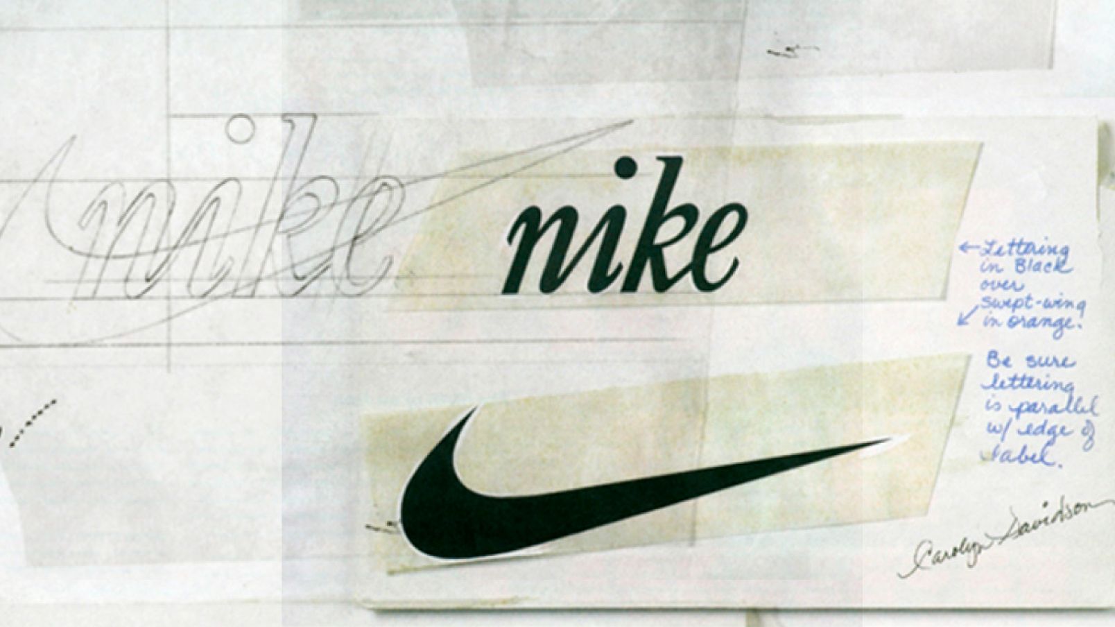
CAROLYN DAVIDSON’S PROCESS SKETCHES OF THE ORIGINAL NIKE LOGO, 1971 (COURTESY OF PRINT MAGAZINE)
Reflecting on this reinforced that time is the hidden ingredient in any branding project – brands must be built over time. It’s everything around a logo that gives it meaning and makes it a richer experience for users – touchpoints such as the messaging and tone of voice, photography, motion and animation, navigation and behavioural iconography, social media... It takes a whole communications strategy implemented over time to build a brand. And this is a hard thing for a client or a board to grapple with when it comes time to approving a new identity to move forward with.
I have so much respect for clients who commission something completely new, collaborate with us and then launch it into the world. And those that have been courageous with their branding have a strong foundation on which they can now communicate.
A strong, considered brand makes you more visible – which has been so important during the pandemic these past few years.