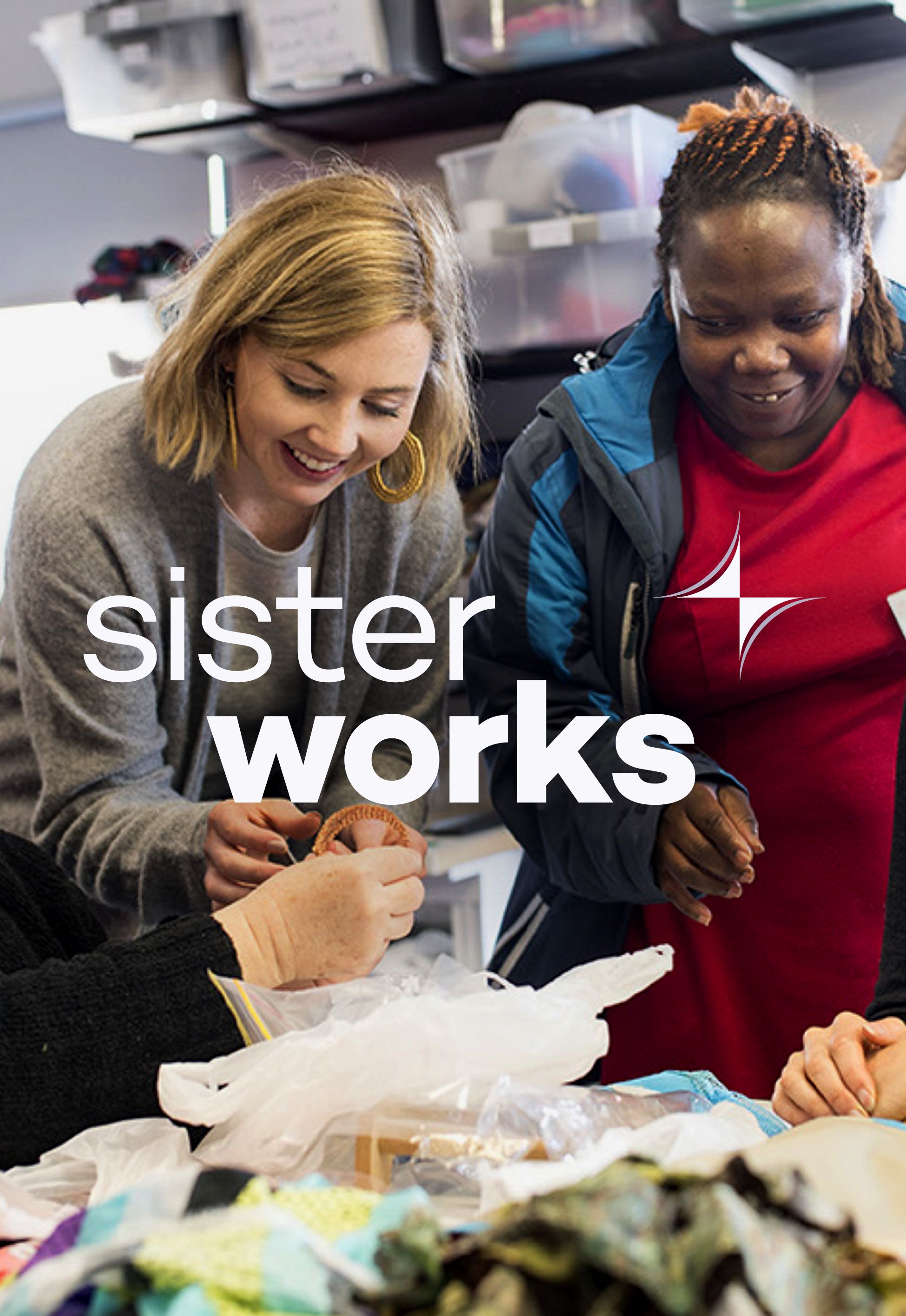
We recently finalised the brand refresh and website for SisterWorks, a not-for-profit social enterprise based in Victoria, Australia. SisterWorks is a cause close to our heart here at Tone. They support women from migrant, refugee, and asylum seeker backgrounds (‘Sisters’) to improve their confidence, mental wellbeing, sense of belonging and economic outlook.
Tone was engaged to rebrand SisterWorks to reflect the evolving, multidimensional nature of the organisation as both an employment service and a retail space. We were also tasked with designing and developing a new accessible website that was faster and less reliant on temperamental plugins and regular upkeep.
Every charity is different, and these are complex projects. So, our process always begins with a series of stakeholder interviews and onsite discovery sessions, interviewing everyone from the CEO to the retail staff. And key to working with charities is interviewing the beneficiaries, or recipients – in this case, the ‘Sisters.’

This is an absolute joy for us. As with most projects, connecting creatives directly with the client is where the magic happens here at Tone.
During the consultation process, one of the SisterWorks staff recounted a conversation she’d recently had with a Sister. “One of the Sisters said, ‘You actually misnamed SisterWorks.’ She said, ‘It should be called Sisterhood.’ That’s what she got out of the programs she’d been doing. She said, ‘I have a community of people I feel I can talk to and connect with.’ This summed up that when the sisters get together, they come alive. This is where the energy and magic come from.
Inspired by this insight, we developed a new symbol – a representation of this Sisterhood, and how women can get help in Australia. The Sisters are from all over the world, so we needed to be able to communicate universally that SisterWorks is a place where you can get help.
LOGO IDEATION
The audience for SisterWorks is very diverse – Australian donors and shoppers who support the charity, along with their beloved Sisters who are new to Australia and may not have a strong grasp of the English language. As a result, our approach to the logo was to keep it very simple for someone new to the English language. We used lower case lettering to make the logo approachable, friendly, and easier to read. At a technical level, we used typeface weights to make the two parts of the name distinctive.
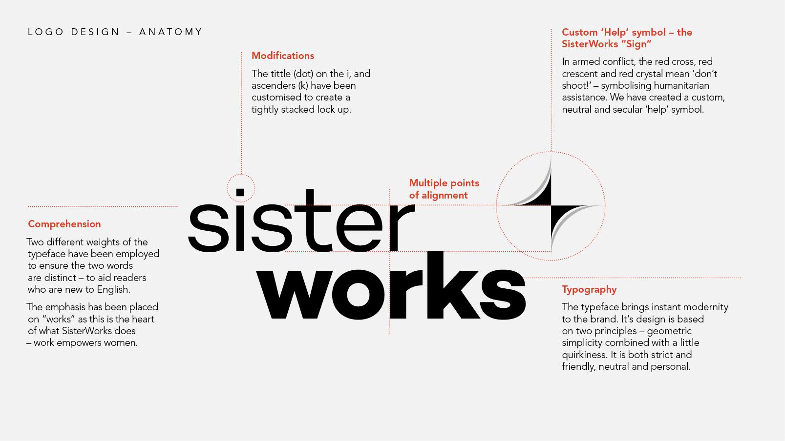
LOGO DESIGN – ANATOMY
This approach aligned with our research into fashion and retail branding, where we uncovered that the concept of a fashion and retail logo is changing – it is evolving into a neutral container designed to leave room for the brand’s character to shine. The way fashion logos are employed is also very different today than it was 50 years ago, due to the different types of media in which a brand’s visual identity is used. A sans serif aesthetic is clearer and more legible across a range of formats, especially digital.
When it comes to colour, contemporary retail brands reinvent themselves each season. They are very monochromatic and take a ‘less is more’ approach. Their colour comes from the seasonal campaign imagery and product photography. We didn’t want to constrain SisterWorks, we wanted to give them a starting point. As such, we kept the brand colour palette limited to a set of strong, accessible purples. Purple is the internationally recognised colour to symbolise women – so we felt it was the perfect choice to represent a modern sisterhood.
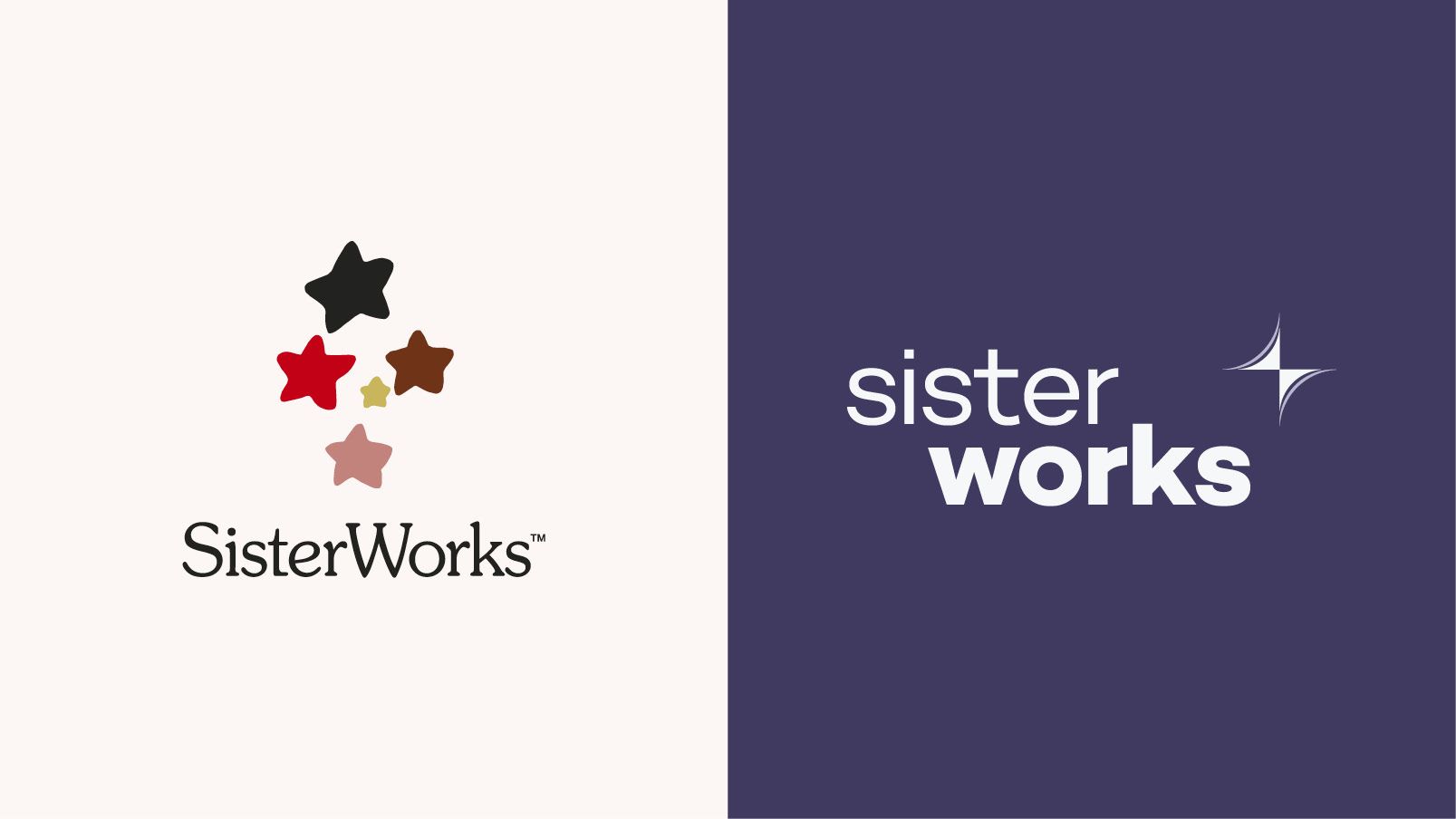
PREVIOUS SISTERWORKS LOGO (LEFT), NEW LOGO (RIGHT).
But what does this look like as a website?
The challenge was that SisterWorks is not just a charity, it is also a social enterprise and retail brand. We leveraged learnings from fashion branding to elevate the website experience. Fashion brands can endure the changing tides of website trends by adopting a clean and sophisticated design for their website. Like the white walls in an art gallery, fashion websites create a void-like atmosphere, (removing any friction in the sale), in which products can be experienced without unnecessary distractions. When the website design is so minimalist, the quality of the product photography showcased becomes crucial.
From a services point of view, it was imperative that there were multiple photographic cues on the website to communicate SisterWorks is a diverse and welcoming environment. The new website design is peppered with large photos showing the comraderies between the Sisters.
THE NEW SISTERWORKS SHOP
Our interviews with the Sisters and other stakeholders also communicated key challenges and issues with the previous website. These requirements were summarised and used to form a set of criteria for guiding the evaluation and selection of the ecommerce platform upon which we built the new SisterWorks shop.
At Tone, enhancing our client’s website speed is a core requirement of every website project we undertake. We know from this report from Deloitte that “a mere 0.1s change in load time can influence every step of the user journey, ultimately increasing conversion rates. Conversions grew by 8% for retail sites … on average.”
Speed was a motivating consideration as we selected the technology stack for SisterWorks. We also worked collaboratively with the SisterWorks team to refine the site map from the previous “flat” website architecture, to a simpler, user friendly site with faster website navigation. We introduced immediate access to important links such as “Donate”. And we introduced a seamless experience moving from the Shop to the main site.
This was supported by the introduction of a modern “headless” content management system (CMS). This approach ensures your new website is lightning fast and utilises the latest website technology employed by companies such as Tesla. This approach also empowered the SisterWorks team to manage and upload content themselves using the CMS’s Visual Editor with a live preview, eliminating the need to rely on external developers and a myriad of plug ins.
Tone was tasked with simplifying the navigation and content for the site and undertaking a tech review to select an e-commerce platform to enhance the shopping experience. We employed a user-friendly CMS to empower the SisterWorks team to manage and update the site moving forward. The resulting website redesign has transformed the SisterWorks website experience to one that is both lightning fast, mobile friendly and intuitive to navigate for both Sisters and shoppers.
You can see the results here – the numbers don’t lie:
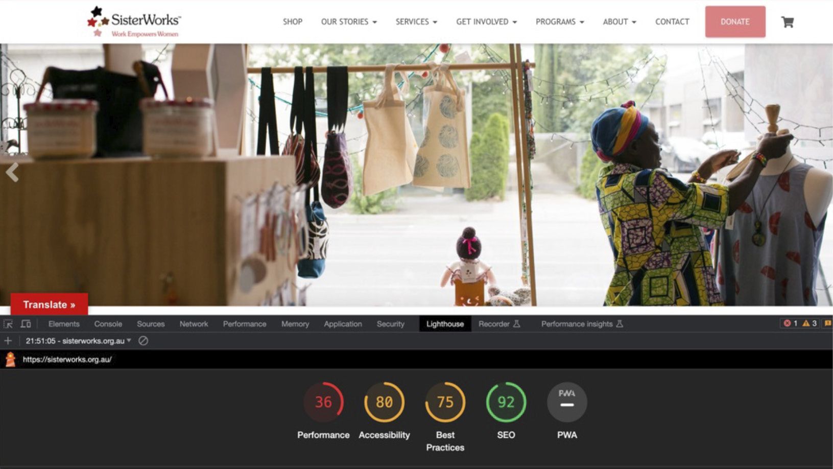
WEBSITE PERFORMANCE BEFORE MIGRATION
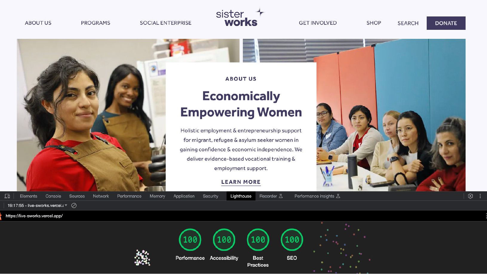
WEBSITE PERFORMANCE AFTER MIGRATION – WOO HOO!
You can learn more about the project by visiting our website case study here.